
PEOPLE BEFOREPIXELS.
Why UX research matters: lessons from Swim Saga.
How listening, mapping and prototype testing helped shape an app around the swimming community.
A good-looking app
is only the start.
A strong visual identity gives a digital product personality. It does not, on its own, tell us whether someone can find an event, recover a password or share a photo with the right audience. Those are questions about the experience, not just the appearance.
At Cat & Bird Studio, Swim Saga brought those questions into focus. The concept grew from the realities of supporting a young competitive swimmer: training routines, meets, club updates and the wish to connect with other families. Research helped move that personal starting point towards a design informed by other people’s needs.[1]
The project combined discovery research with mobile and desktop interface design. Its value is not a claim that research made the app perfect. It is the visible connection between what people needed, what we designed and what testing showed still needed attention.[1][2]
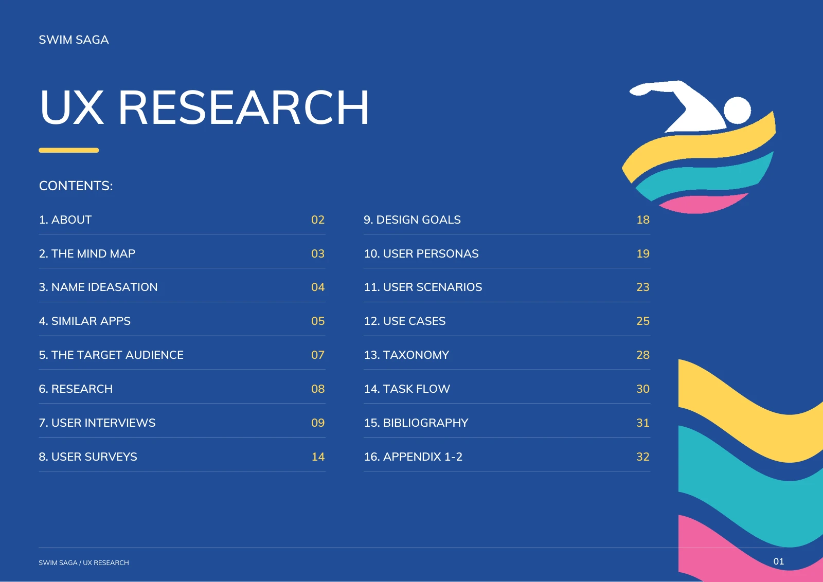 View full size
 One community.
Different priorities.
“People interested in swimming” was too broad to guide detailed interface decisions. The research considered parents, teenage swimmers, coaches and clubs. Four research personas brought their different priorities into view: staying informed, creative expression, efficient communication and privacy. These were design tools, not four additional test participants.[1]
A parent checking a schedule between work and training is not doing the same job as a teenager sharing a race video. A coach communicating a last-minute change needs a different path again. Scenarios and task flows made those differences practical: what does this person need to do, and what should happen next?[1]
Listen before adding features
Interviews explored existing habits, including mobile use, photo and video sharing, finding relevant posts and keeping up with club news. They also surfaced concerns about privacy, unwanted messages, registration outside the app and password recovery. Survey questions explored desired resources, content and features alongside those conversations.[1]
The research conclusions prioritised in-app registration, privacy settings, creative sharing tools and clearer content categories. That gave the design a direction beyond simply adding more features.[1]
Make the findings
visible in the design.
The most useful research does not stop at a report. It helps explain why a screen, label or control deserves to exist. In Swim Saga, the research priorities connect to several concrete interface decisions.[1][2]
Keep the first steps together.
Research: registration and password recovery could interrupt people’s experience.
Design response: the app designs include sign-in, registration and reset-password screens, rather than treating access as a separate website-only journey.[1][2]
Make sharing a deliberate choice.
Research: parents described limiting who could see children’s photos and personal information.
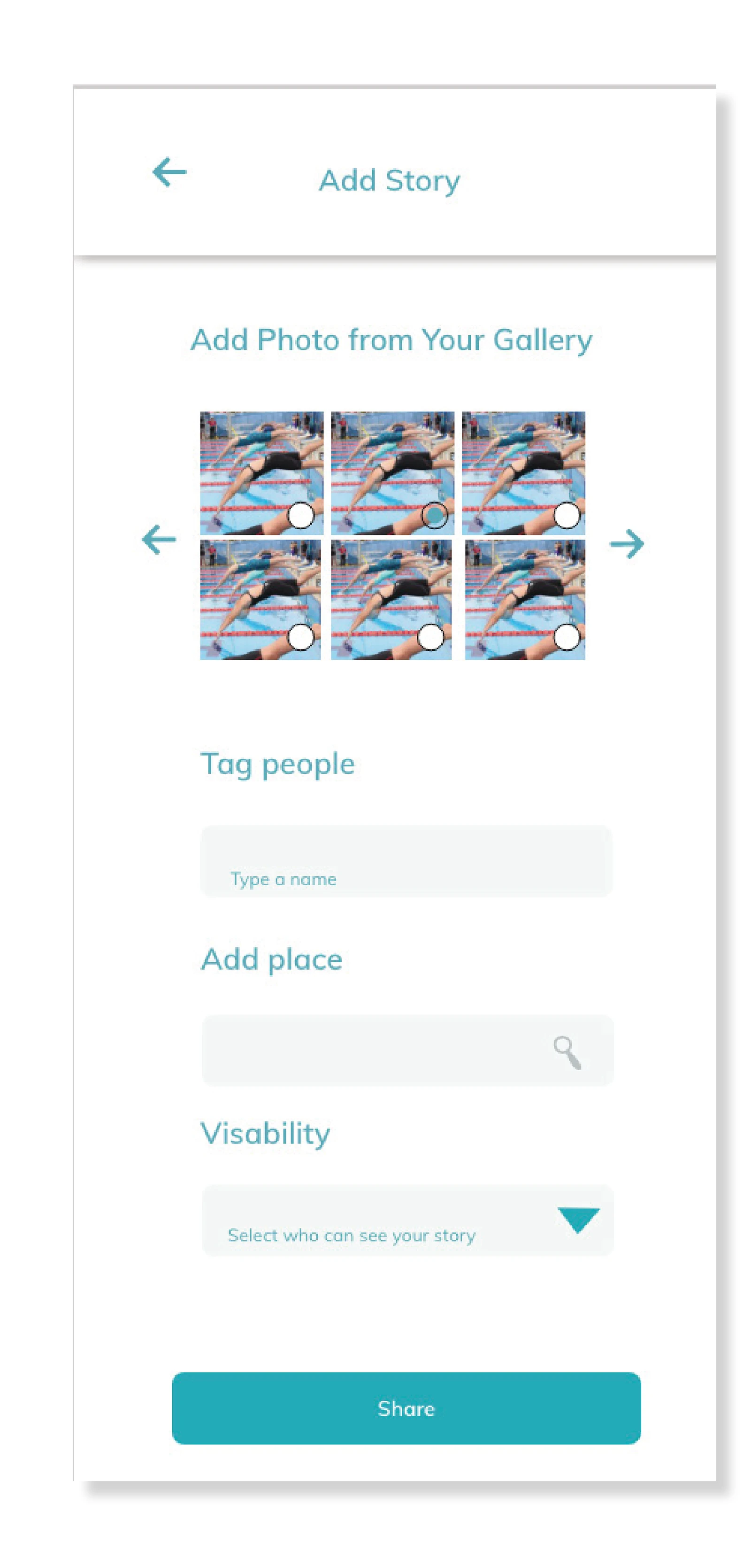
Design response: the Add Story screen includes a visibility selector alongside the sharing action. The design makes audience selection part of the task; it is not evidence that the underlying privacy protections have been implemented or verified.[1][2]
Give frequent tasks a home.
Research: people needed relevant stories, meet information and club updates without searching across disconnected channels.
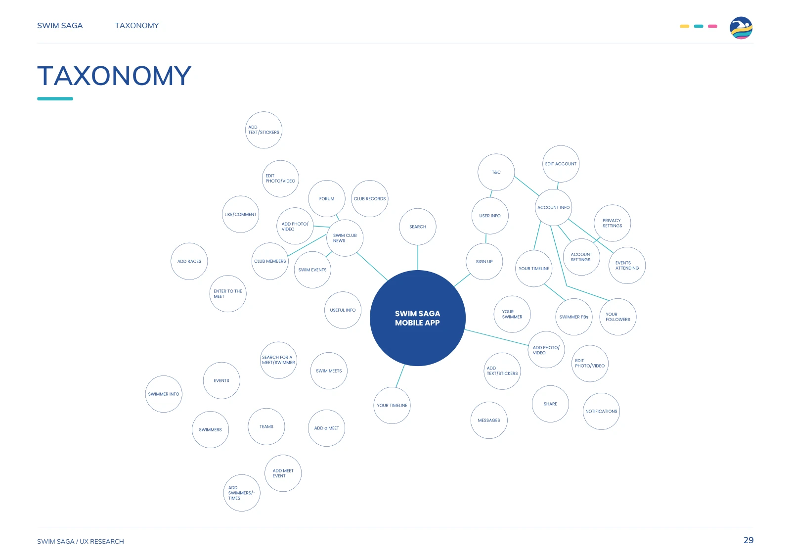
Design response: the information structure and repeated navigation separate Home, Meets, Add, My Club and My Profile, with search and messaging available in the interface.[1][2]
Support the ways people already share.
Research: photos, videos, brief descriptions and tags were familiar parts of participants’ swimming stories.
Design response: the designs include a media-led feed, gallery selection, tagging and separate post and story entry points. The aim was to make those familiar activities easier to recognise in a swimming-specific setting.[1][2]
The small steps
are the experience.
Login, forgotten passwords and registration are not the most glamorous screens in an app. They are still part of the journey. Showing the screens together helped consider how someone would enter the product and recover when they could not remember their details.[2]
The registration design also distinguishes some personal information from what is displayed publicly. That connects the access journey to the privacy concerns identified during research.[1][2]
 View full size
 Not just “share”.
Share with whom?
When content involves a child’s swimming journey, audience choice matters. The Add Story design brings photo selection, tagging, place and visibility into one screen before the Share action.[1][2]
This is also a useful research question for the next iteration: can someone explain who will see their story before they post it? A visible control is a design response. Observing whether people understand and use it is the next test.
 View full size
 Make the map
before the interface.
The taxonomy and task flows connected content, screens and actions before the experience was treated as a collection of polished layouts. The research mapped tasks such as adding a story, finding club news, posting updates and limiting viewers.[1]
The visual system then gave that structure a coherent identity: a swimmer-and-wave mark, blue, turquoise, yellow and pink, Muli typography, repeated icons and consistent buttons. Research informed the priorities; design translated them into a recognisable product.[2]
 View full size
 Positive feedback.
Useful friction.
The phone-prototype report records testing with four participants. It describes a positive response to the layout, spacing and navigation, and reports that sign-up and login were straightforward. It also records specific issues that a visual review alone would not resolve.[2]
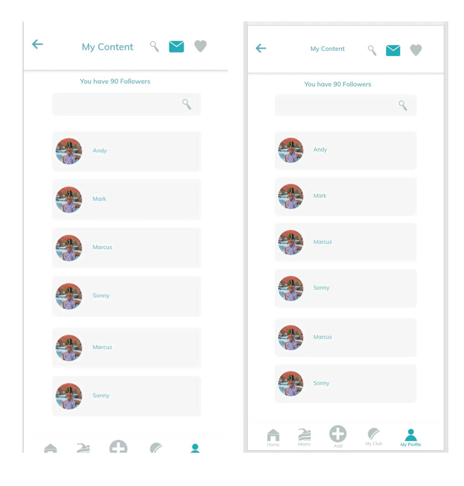
Some headings were difficult to read because of their size. Story posting needed clearer text fields and a more understandable sequence of actions. Participants also wanted more control over where a post would appear, and the review recommended adding follower totals for context.[2]
These findings made the next changes concrete: improve readability, clarify the posting journey and provide useful information where people expect it. The design document includes interface iterations showing a follower total and revised heading sizing.[2]
 View full size
 Research gives the next
decision a reason.
For a business, the practical lesson is to connect research to decisions. Rather than debate whether a screen looks “easy”, choose a task and observe what happens. Can someone find the next meet? Recover access? Post to the intended audience? Recognise the next step without help?
For Swim Saga, a sensible next round would retest the revised headings and story flow, check audience selection, and assess readability and interaction on real devices. Those are proposed next steps, not work claimed as completed in the supplied documents.
UX research is not a replacement for creative judgement. It gives that judgement something stronger to work with: people’s needs, observed difficulties and a clear reason to refine the design.
- 01Ask a useful question.
Decide what you need to learn before choosing a method. - 02Watch real tasks.
Look beyond visual preferences to where people pause, guess or get stuck. - 03Turn evidence into action.
Prioritise changes and state what each change is intended to improve. - 04Test the change.
A revised screen is a new hypothesis until its use has been observed.