
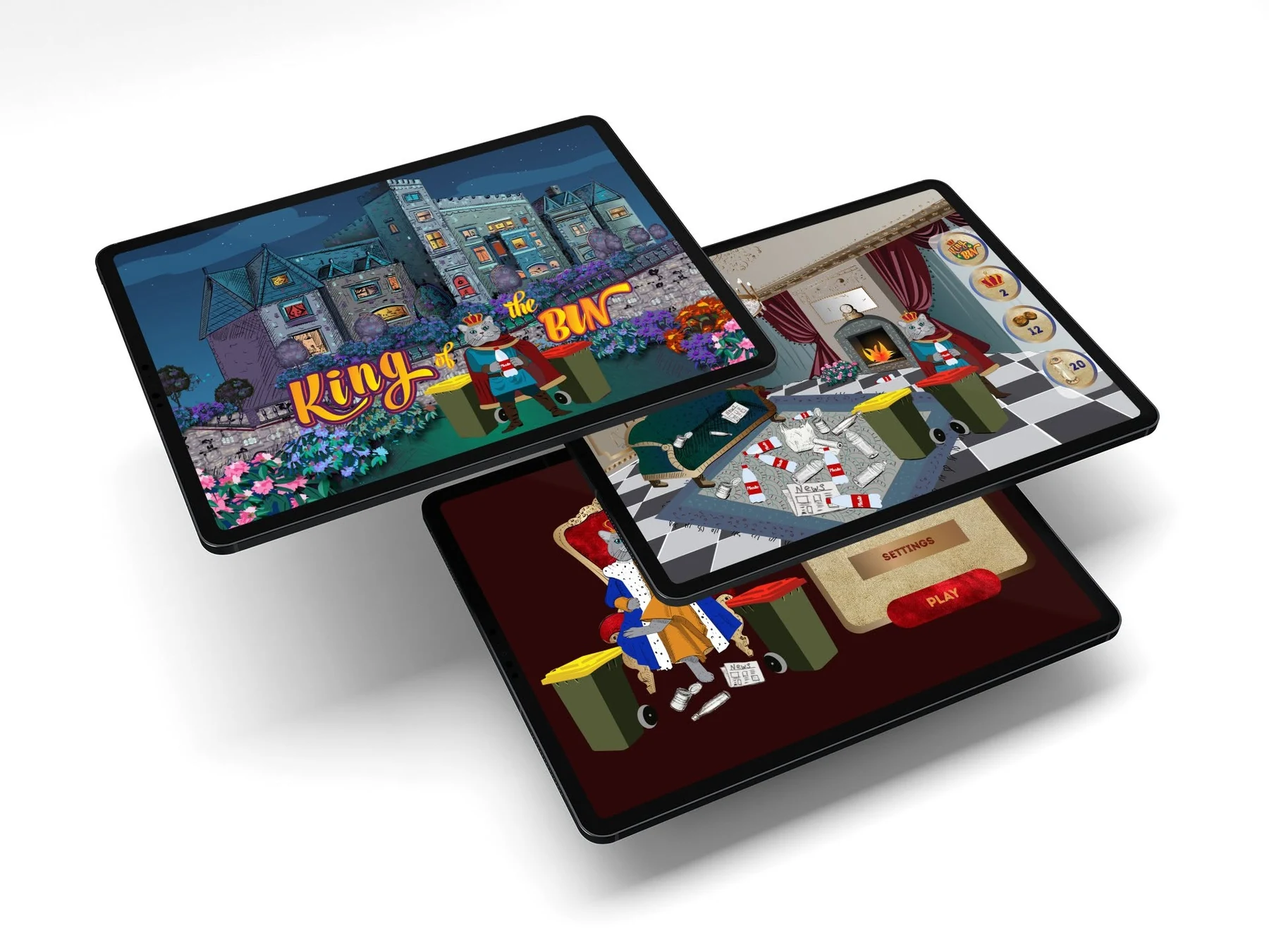
ProjectKing of the Bin
ScopeGame identity, illustration and UX/UI
AudienceChildren and families
PurposeTeaching correct rubbish sorting through play
Turning waste sorting into a playful story.
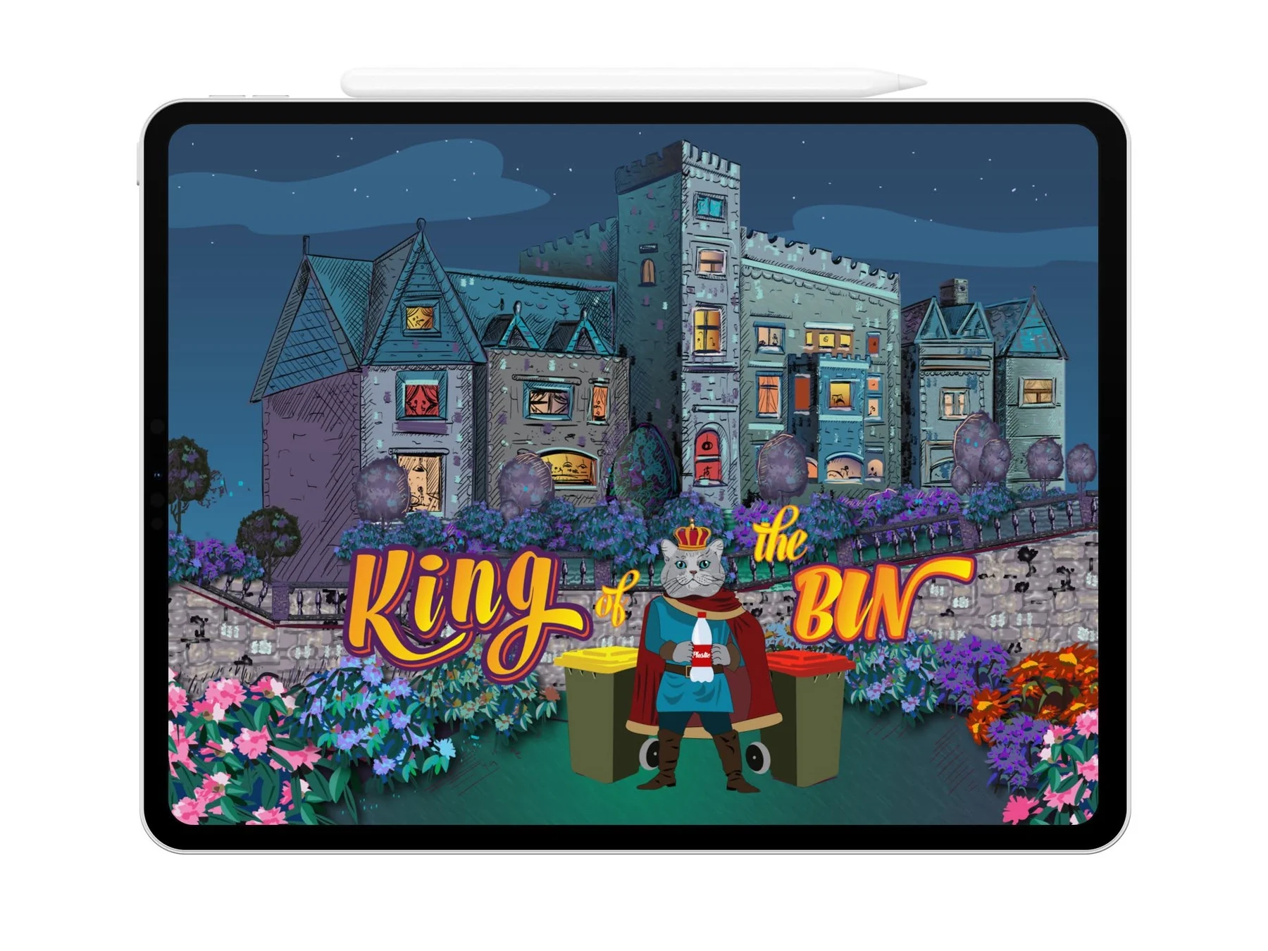
King of the Bin is an educational game created to help children learn how to sort everyday rubbish into the correct bin. Rather than presenting recycling as a list of rules, the experience transforms the lesson into an imaginative challenge led by a crowned cat, a grand castle and a collection of memorable game objects.
Cat and Bird Studio developed the complete visual world from scratch. The project began with hand-drawn concepts and grew into a bold game identity, original characters, illustrated environments, collectible objects, menus, reward screens and interactive gameplay graphics.
The final direction combines storybook detail with clear digital interaction, keeping the game visually exciting while ensuring younger players can understand each choice quickly and play with confidence.
A royal adventure.
An everyday lesson.
The visual identity brings together theatrical royal references and familiar waste-sorting objects. A crowned cat acts as the central character, while wheelie bins, bottles, newspapers, coins and an hourglass are reimagined as recognisable parts of the game world.
Deep burgundy, teal, gold and magenta create a rich, playful palette. Textured illustration, ornate details and expressive lettering give the game a distinctive handcrafted personality without compromising on-screen clarity.
A complete
game world.
Game concept and visual art direction
Logo and illustrated title treatment
Original character and costume design
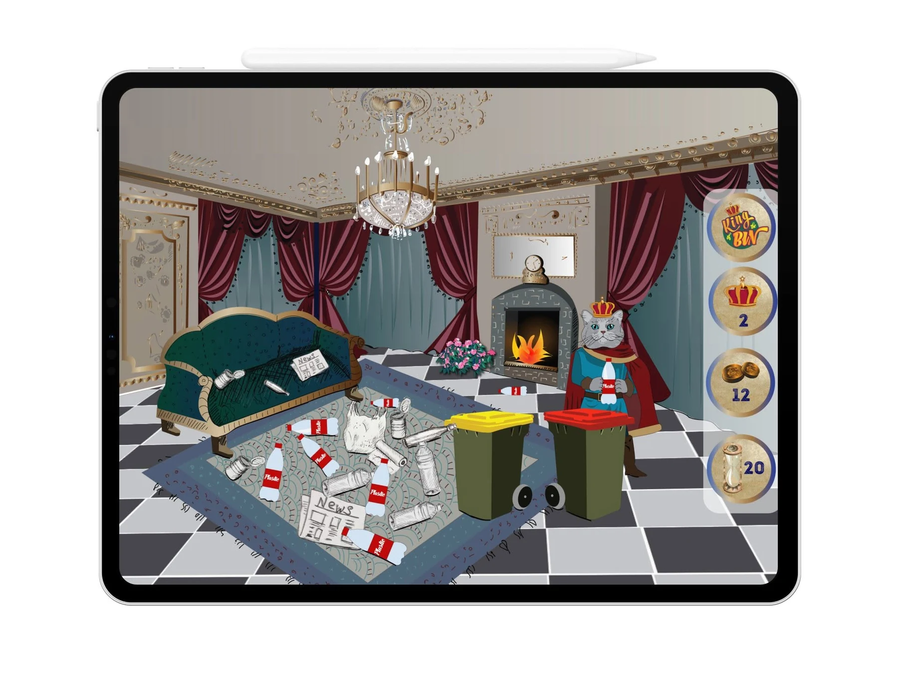
Castle, room and environmental illustration
Game objects, rewards and collectible artwork
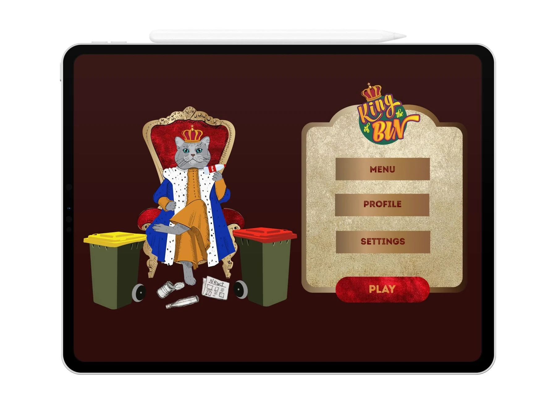
Menus, status cards and gameplay UX/UI
Educational sorting interactions and feedback cues
Promotional and merchandise artwork
Clear choices.
Rewarding progress.
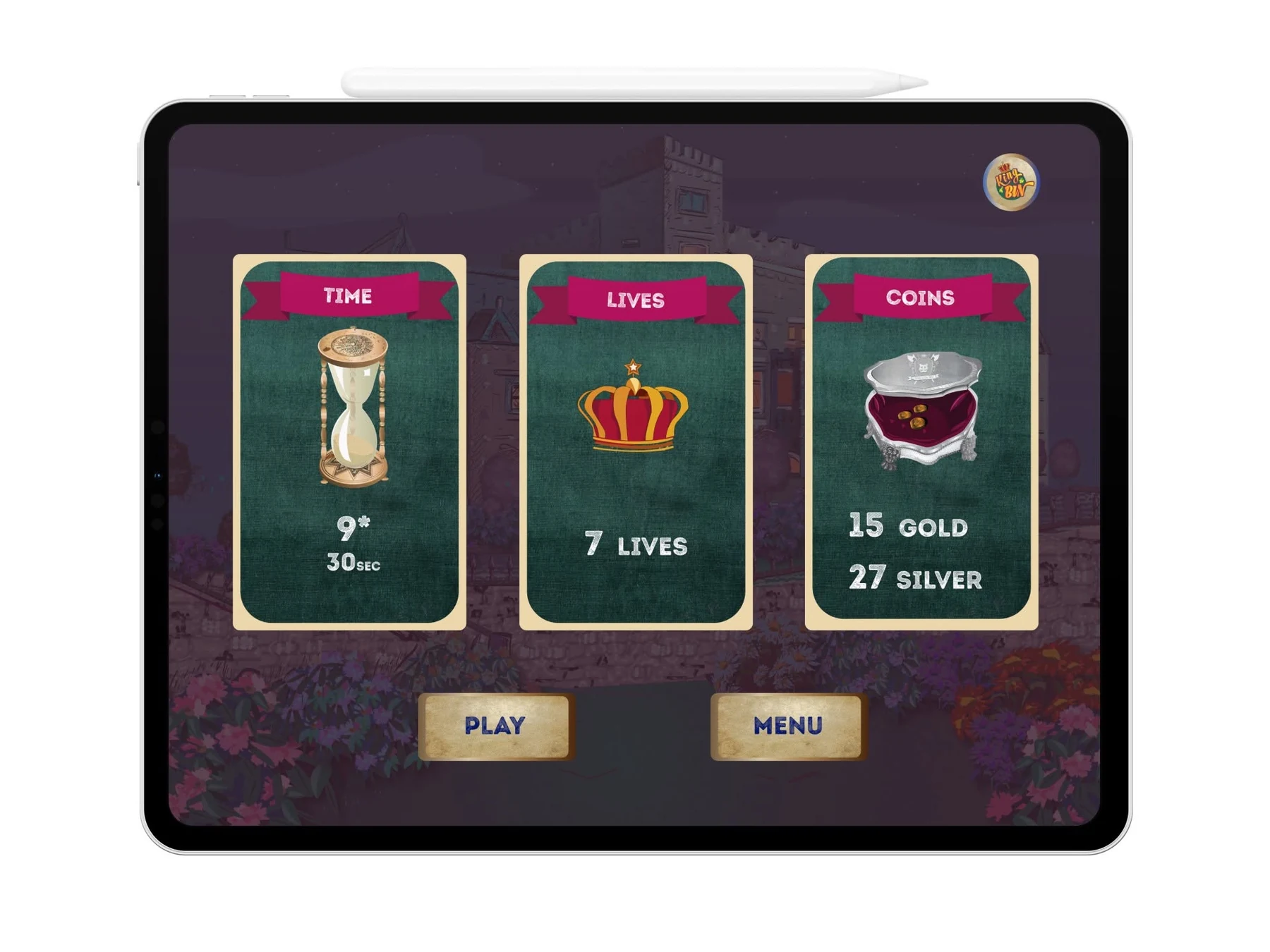
The interface is structured around short, obvious decisions. Large cards present time, lives and collected coins; prominent buttons keep the next action clear; and familiar colour-coded bins support quick recognition during play.
Drawn by hand.
Built for interaction.
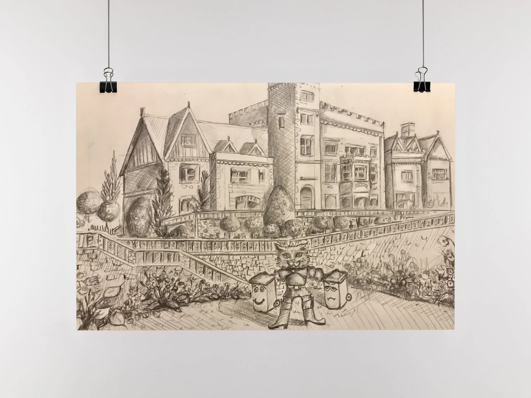
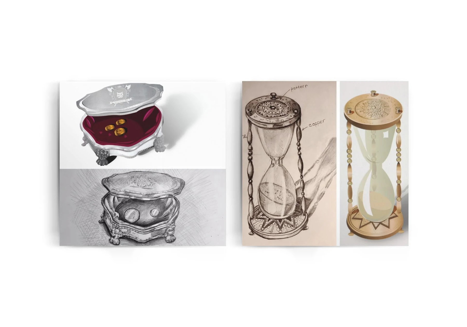
Pencil studies established the architecture, character placement and collectible objects before they were refined digitally. This process gave the finished game a unique visual language rather than relying on generic asset libraries.
Characters that live
beyond the screen.
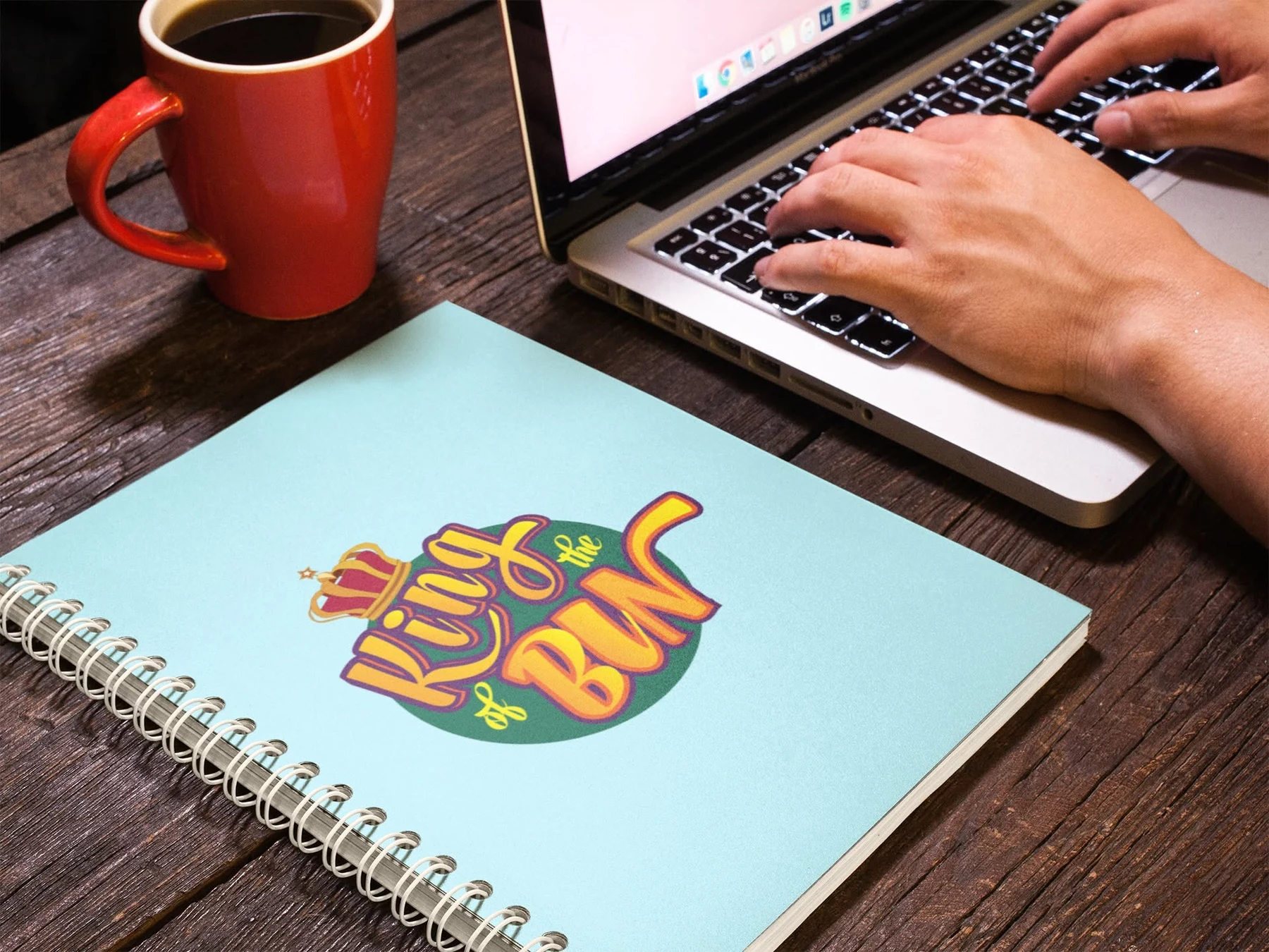
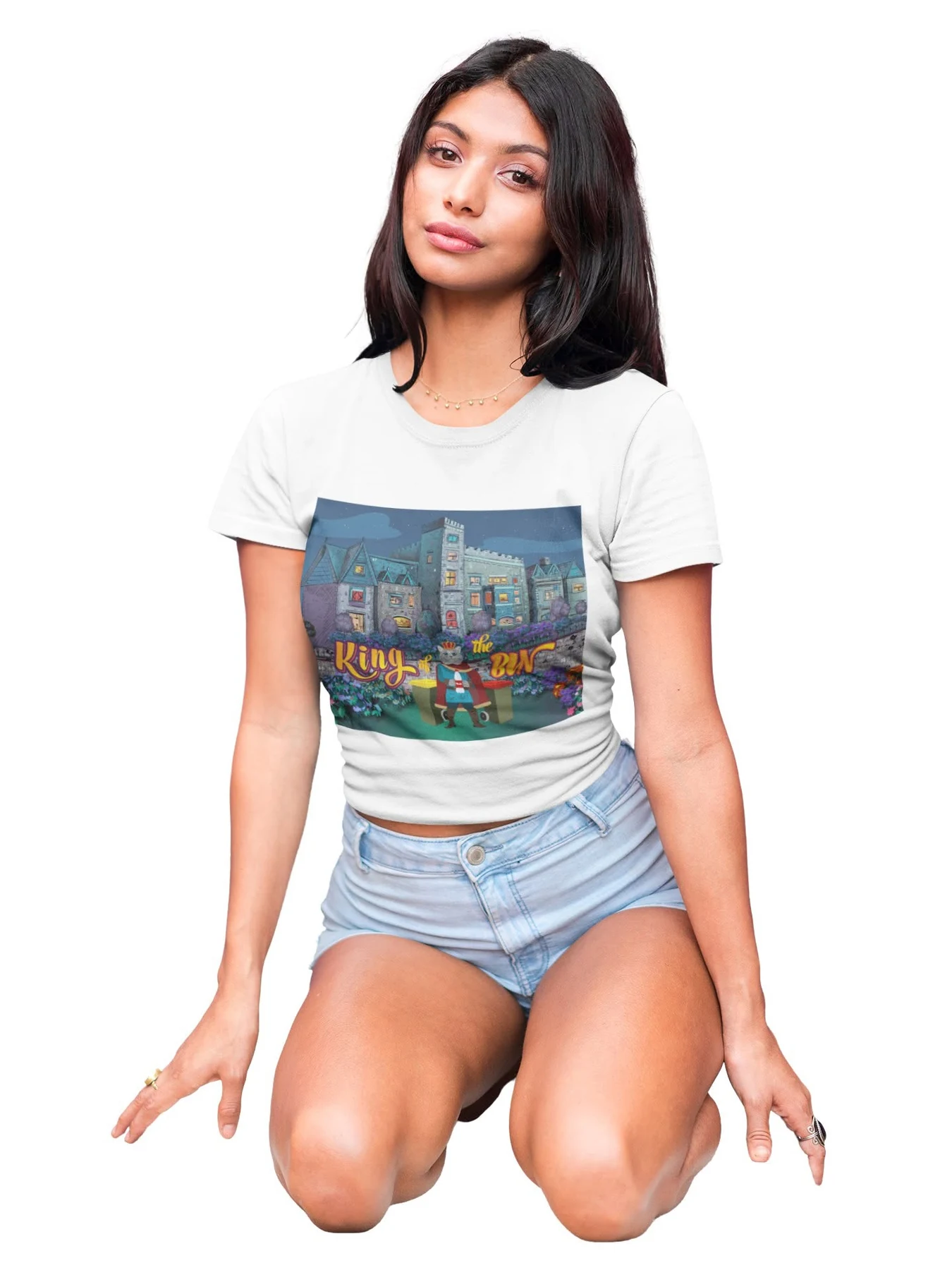
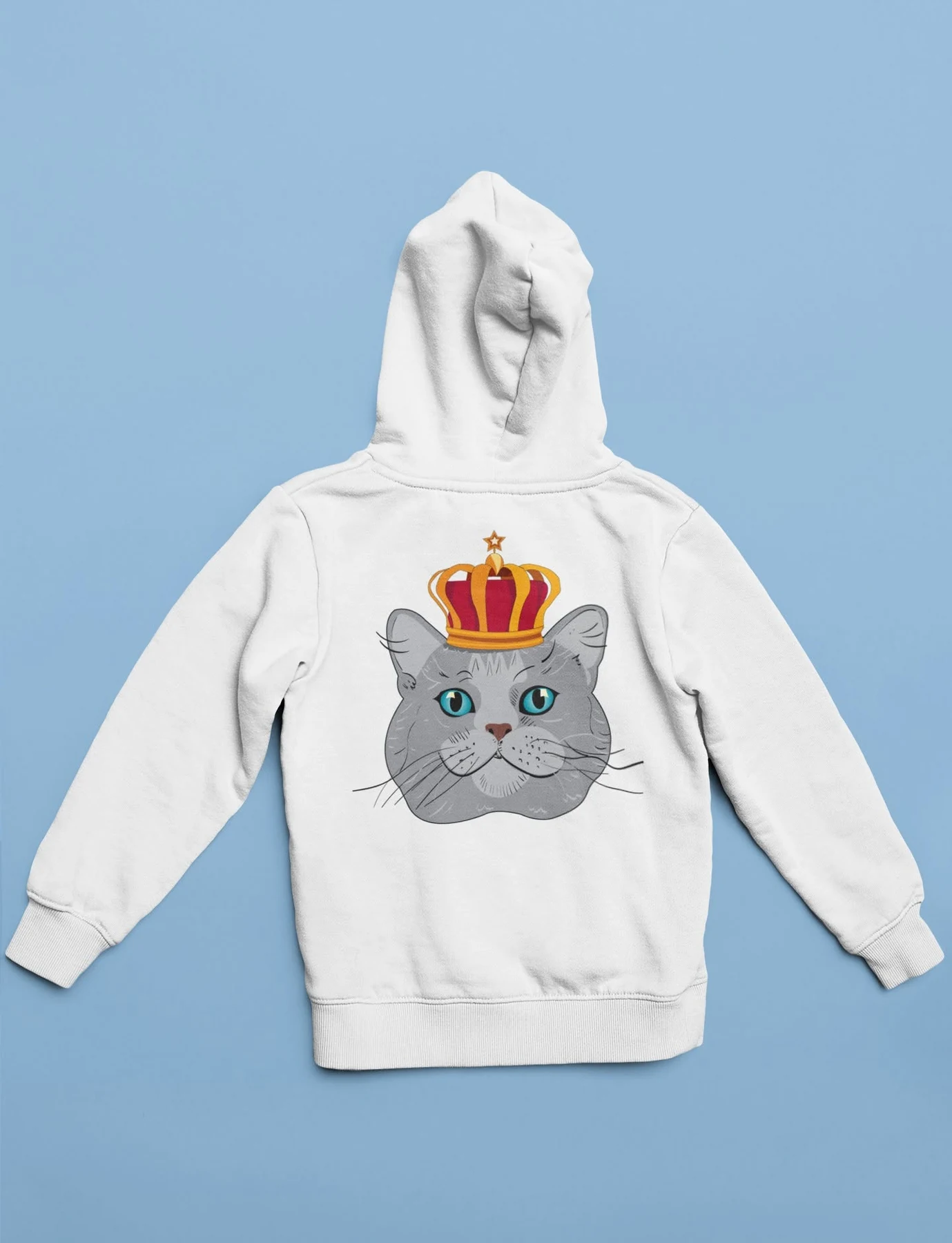
The title artwork and custom characters were extended into merchandise and promotional pieces, showing how the illustrated identity can support a broader game brand.
An educational challenge with its own memorable world.
The finished design turns correct rubbish sorting into a playful and motivating activity. Custom illustration gives King of the Bin a distinctive personality, while clear controls, recognisable objects and immediate progress feedback help children understand the task independently. The result is a bold game identity that makes an important environmental lesson feel imaginative, approachable and fun.
Back to our work