
ClientHealthy Backyard Gardens
ScopeLogo design and visual identity
IndustryHome gardening and fresh produce
ApproachFriendly, practical and nature-led
A compact identity inspired by homegrown produce.
Healthy Backyard Gardens helps people grow fresh produce through custom garden beds and practical gardening support. Cat and Bird Studio created a friendly, recognisable identity that reflects the business’s hands-on approach and connection to healthy food.
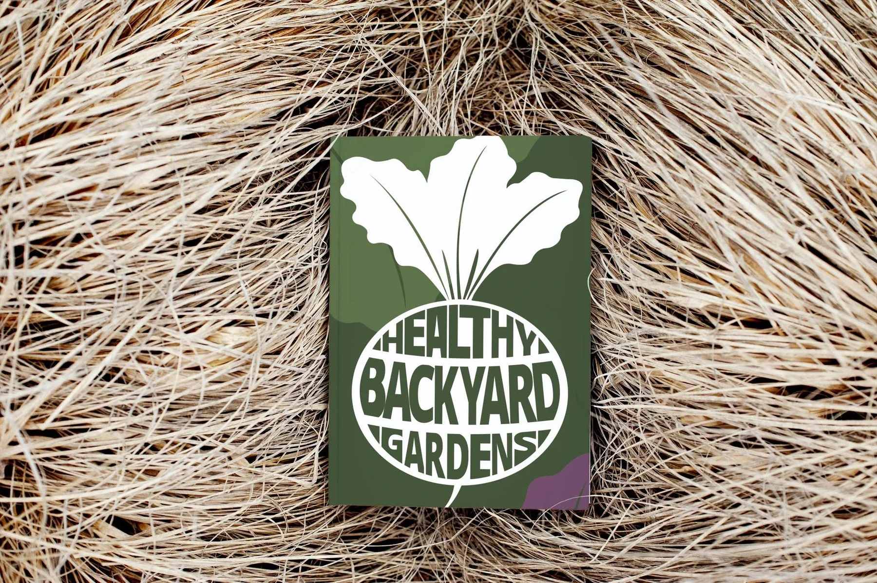
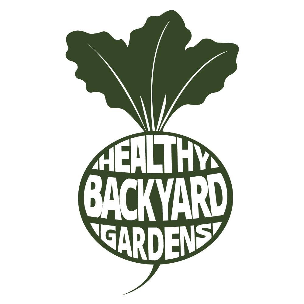
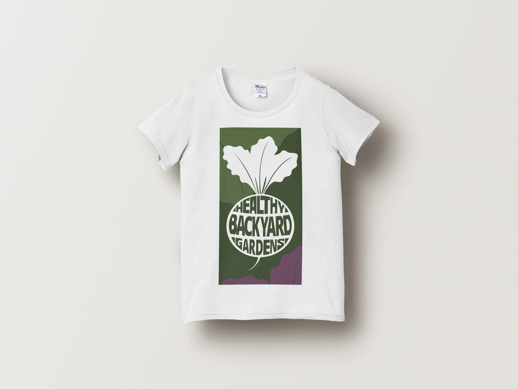
The central idea combines a beetroot silhouette with a custom typographic treatment. Leafy tops communicate fresh produce immediately, while the business name is built directly into the rounded vegetable shape. Bringing the symbol and name together creates one distinctive mark that remains easy to recognise without a separate icon or wordmark.
A rich garden green forms the natural foundation of the identity. A muted plum accent adds warmth and personality, while generous white space keeps the system fresh, clear and adaptable.
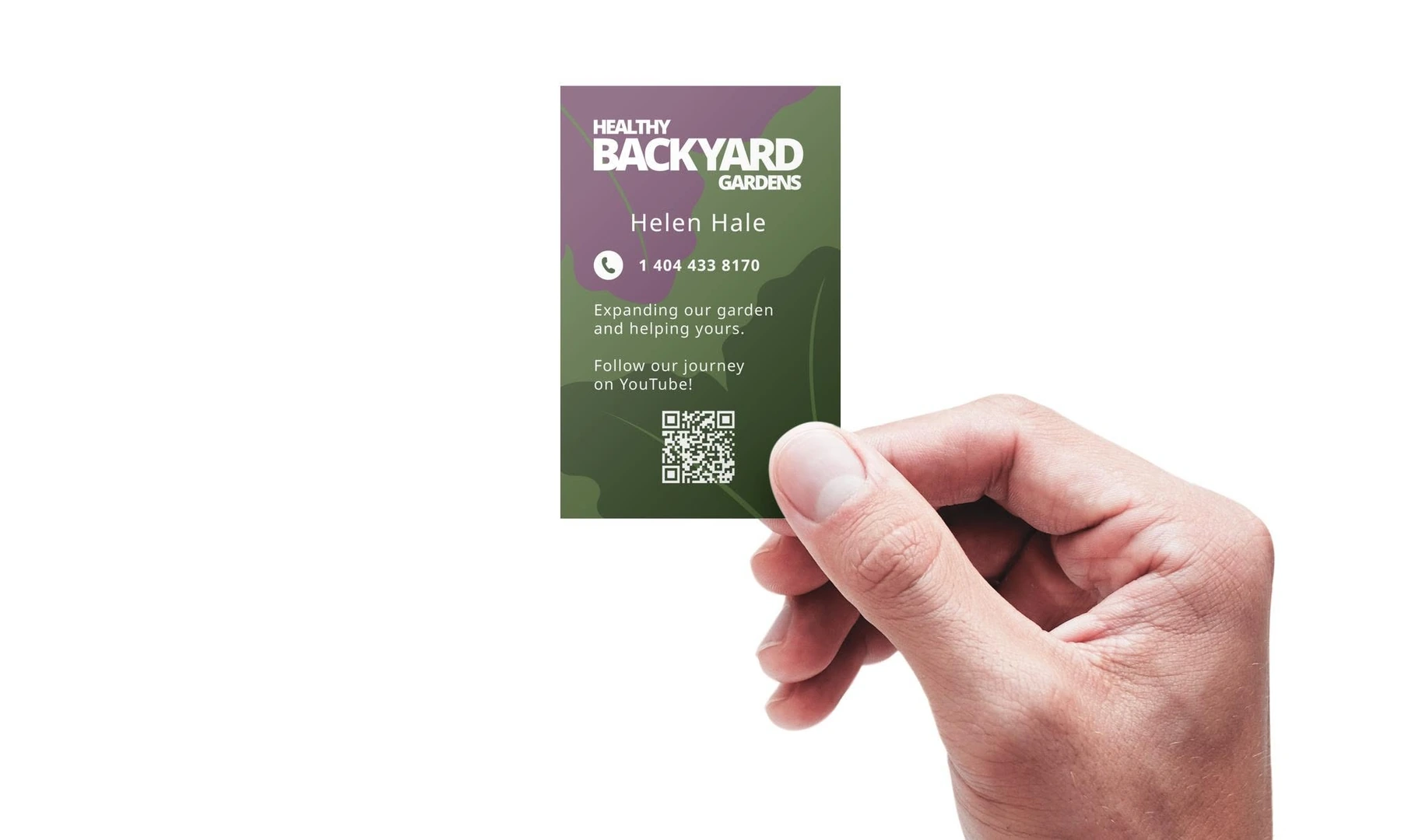
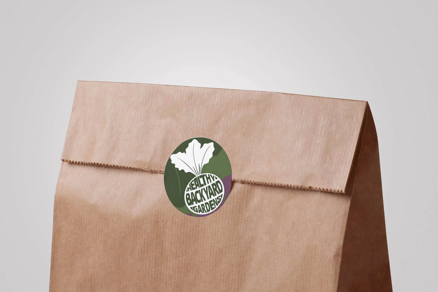
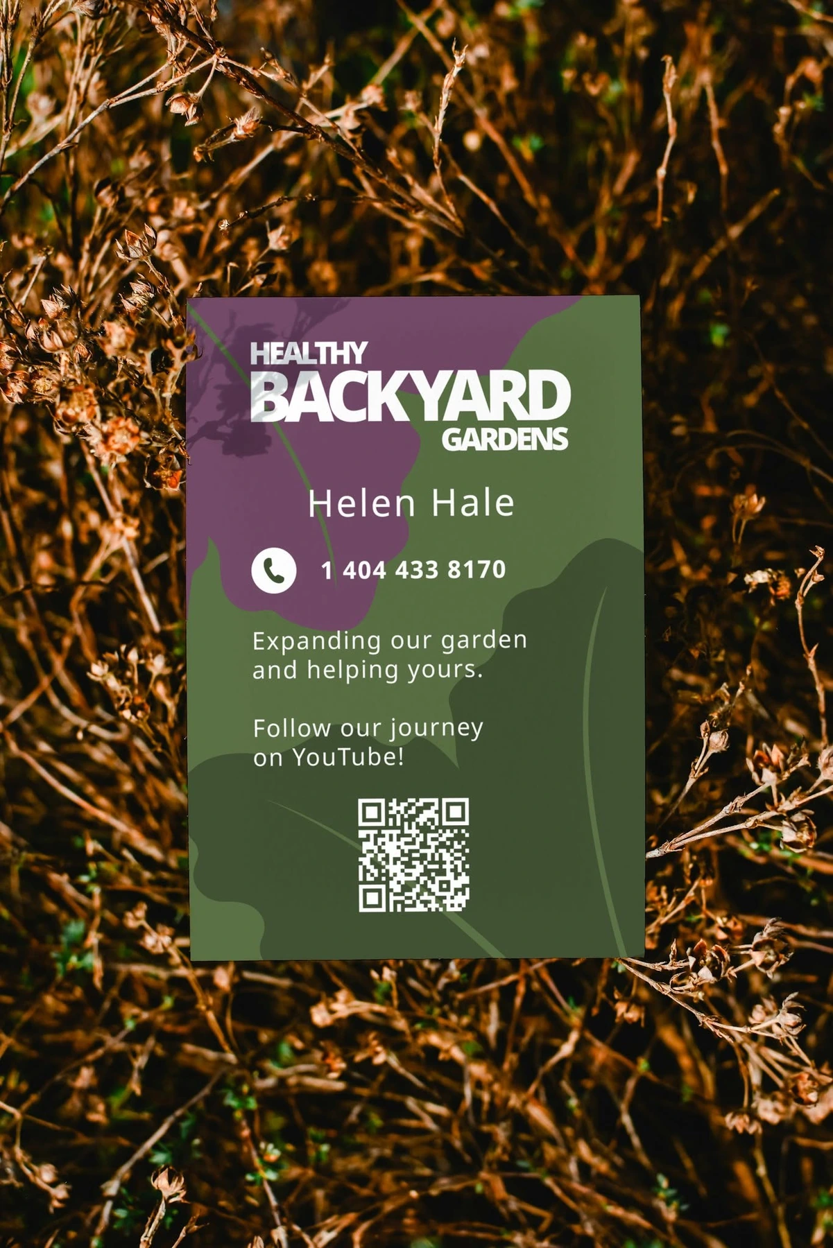
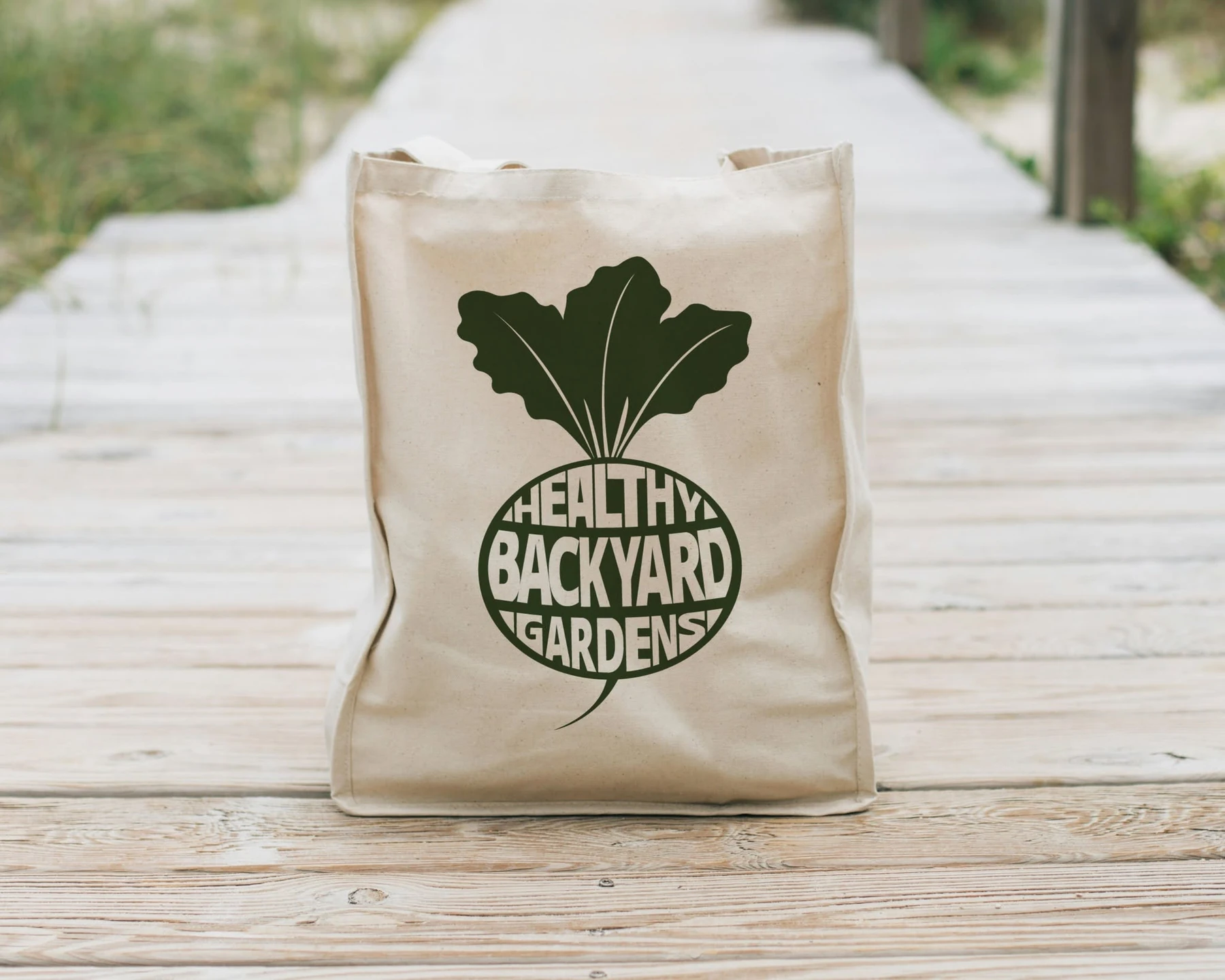
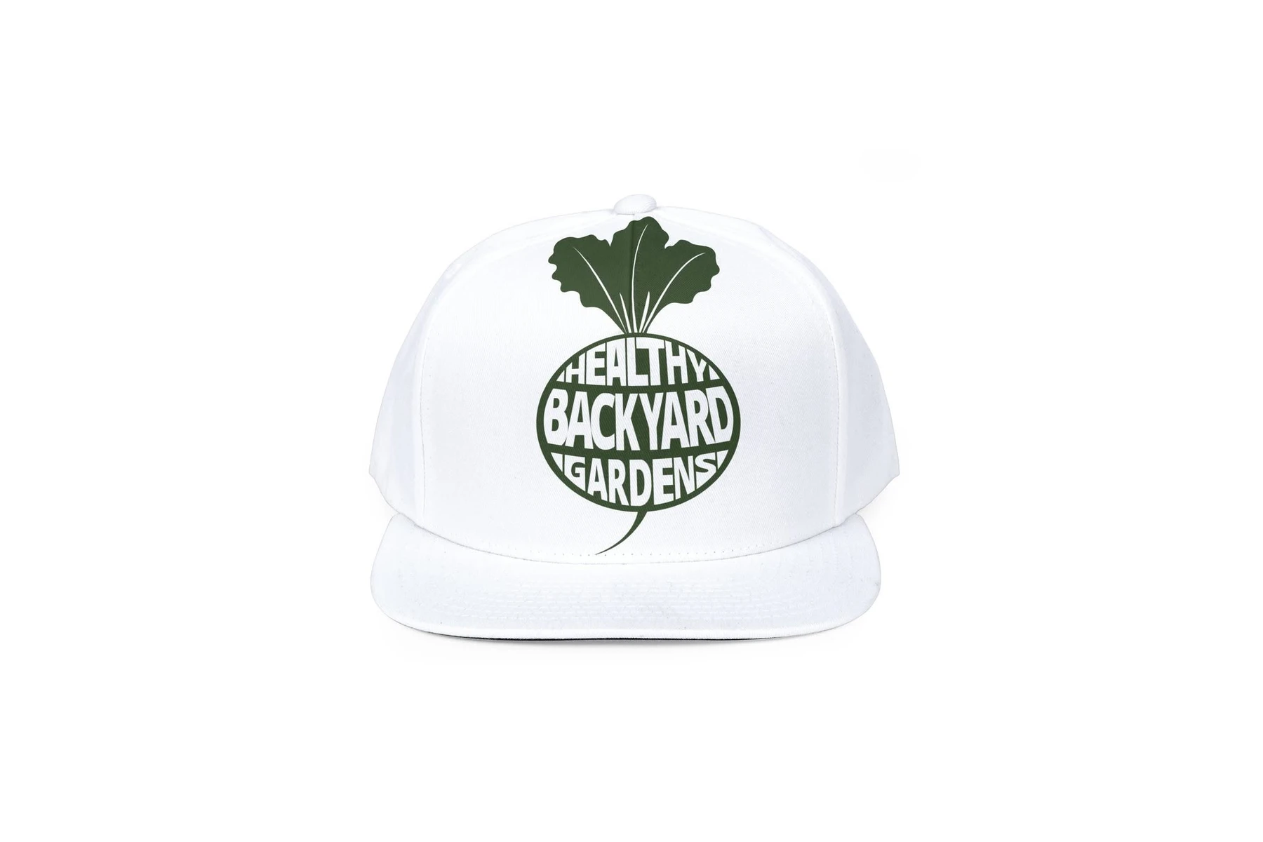
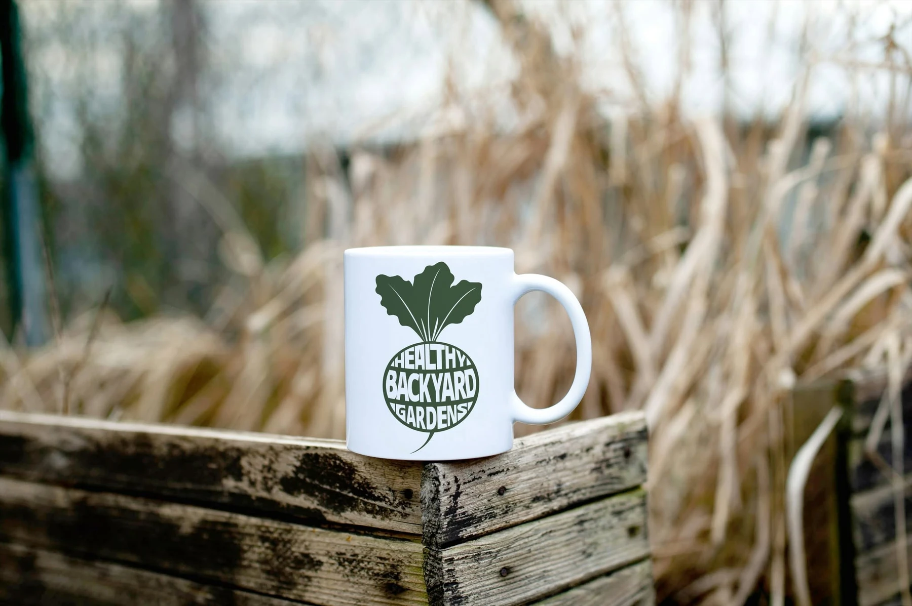
The design was developed for practical everyday use. A simplified one-colour version works cleanly on caps, tote bags, mugs and T-shirts; a compact round format becomes a packaging sticker; and flexible rectangular layouts support business cards, QR-led flyers and local promotional material.
One strong shape.
Many useful formats.
The beetroot creates an immediate link to gardening and fresh food. Custom lettering fills the organic form, giving the identity a playful character while keeping it compact enough for small labels, social icons and merchandise.
Simple to recognise.
Easy to grow.
Logo concept and custom typographic mark
Primary colour palette and visual direction
Business card and QR promotional collateral
Packaging stickers and compact logo formats
Merchandise graphics and one-colour applications
Consistent brand presentation across print and products
Grounded in nature.
Designed for real life.
Natural materials and garden settings reinforce the brand story, while clear contact details and QR-led calls to action make the promotional pieces useful as well as distinctive.
Clear at every scale.
Consistent on every surface.
The compact silhouette gives the identity enough strength to stand alone across simple, one-colour merchandise and practical everyday items.
A friendly garden identity that communicates its purpose at a glance.
The finished mark is simple, distinctive and easy to apply. Its beetroot shape immediately connects the business with fresh produce, while the integrated lettering gives Healthy Backyard Gardens an ownable visual signature. The flexible one-colour system keeps the brand consistent across cards, packaging, clothing and everyday promotional products.
Back to our work