
ClientExpire Alert 4U
ScopeBranding & UX/UI
PlatformMobile application
A friendly identity for an important reminder.
It was a pleasure for Cat & Bird Studio to create the branding and UX/UI design for the Expire Alert 4U mobile app.
The app helps users keep track of the expiry dates of important medications and medical devices by sending reminders before they expire, helping ensure essential treatments are always available when needed.
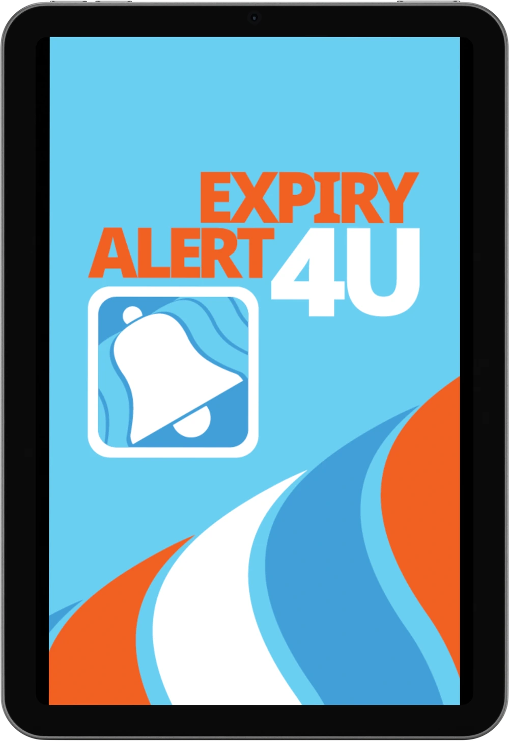
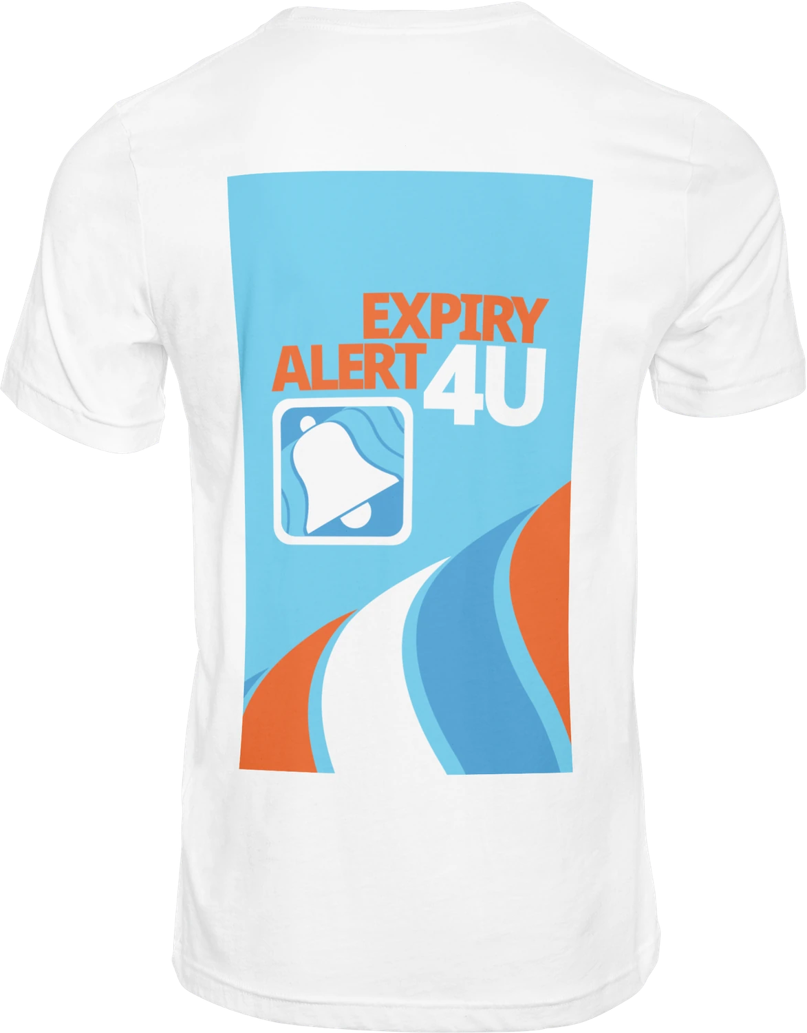
Our goal was to create a clean, modern and memorable brand that inspires trust while remaining friendly and easy to use. The logo features a stylised notification bell, symbolising timely reminders, while the blue colour palette represents safety, reliability and healthcare.
The user interface was designed with simplicity in mind, using clear typography, intuitive navigation and bold calls to action to make the app accessible for everyone.
Clear, reassuring
and easy to remember.
The notification bell became the central brand symbol, supported by a bright healthcare blue, a lighter blue and a high-energy orange accent.

From identity
to interface.
Brand identity and logo design
Mobile app UX/UI design
Colour palette and typography
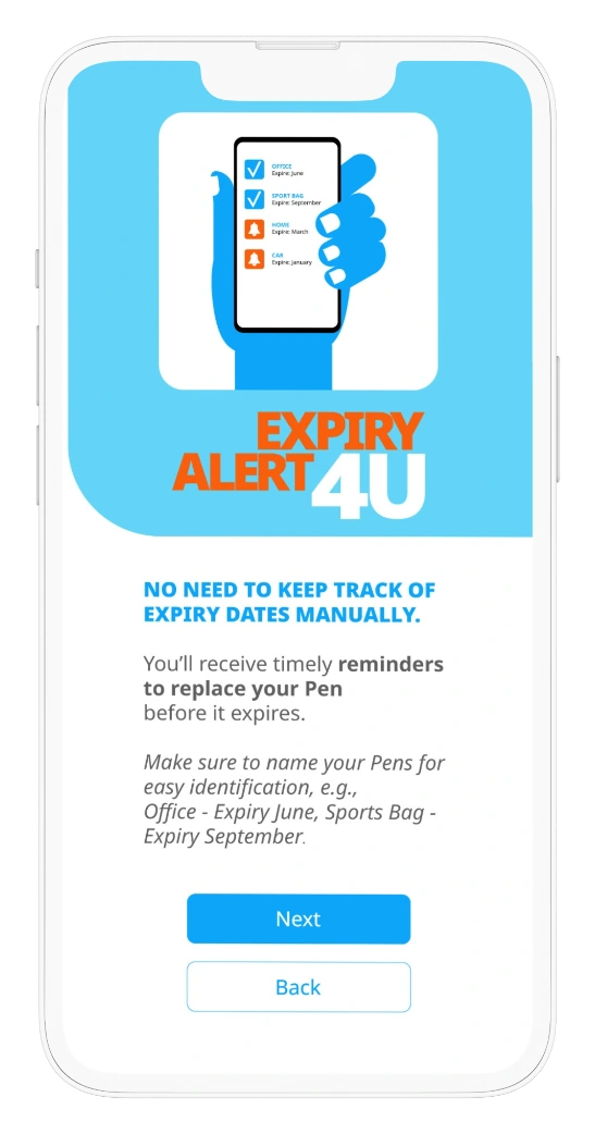
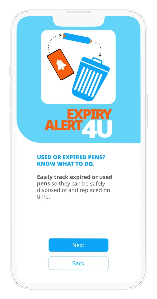
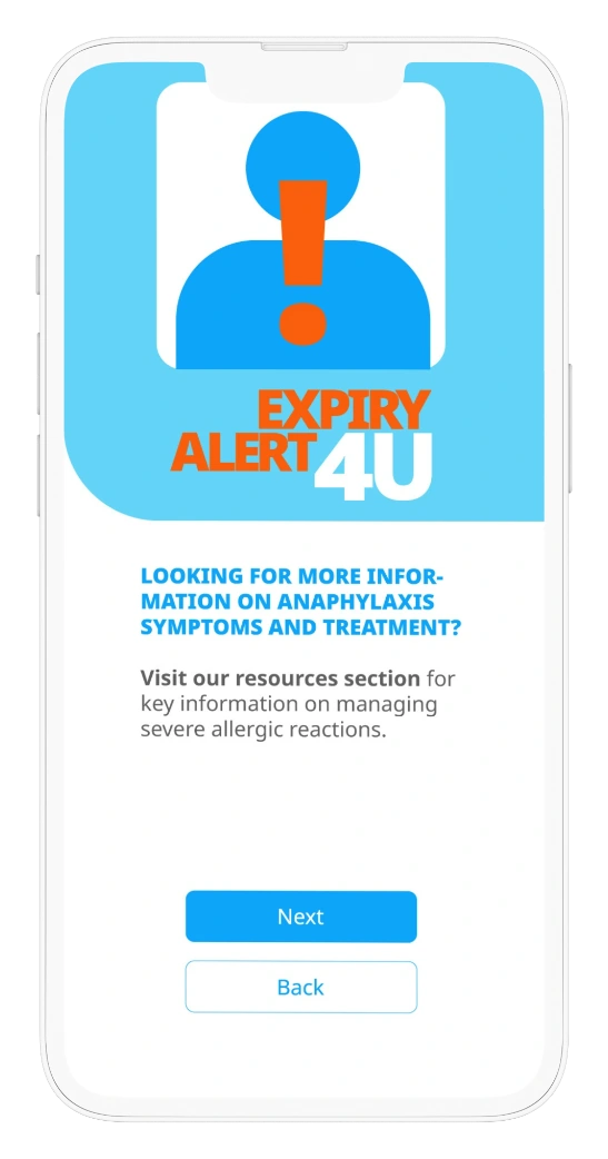
Onboarding screens
Icon and button design
App Store visual assets
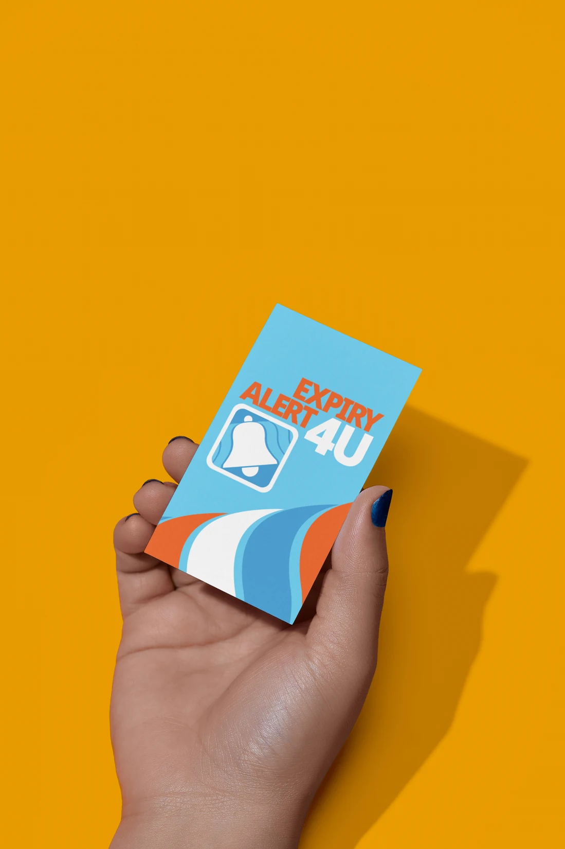
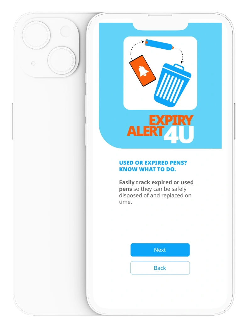
Designed to work
on and off screen.
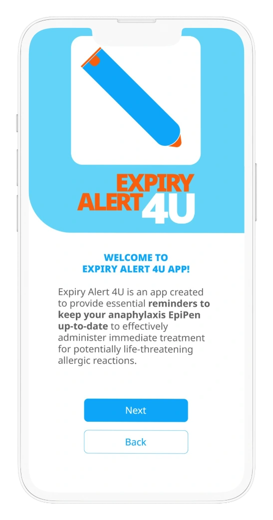
Simple guidance.
Confident actions.
The onboarding experience introduces the app in clear stages, using bold illustrations, direct language and consistent controls.
A flexible identity
across every touchpoint.

Fresh, professional and easy to use.
The result is a fresh, professional and easy-to-use mobile app with a strong visual identity that supports its mission of helping users stay organised and prepared.
Back to our work