
ClientEco Protect
ScopeBranding, app, web & illustration
IndustryEco-conscious personal care
ApproachCreated from scratch
A complete brand world built around nature, care and protection.
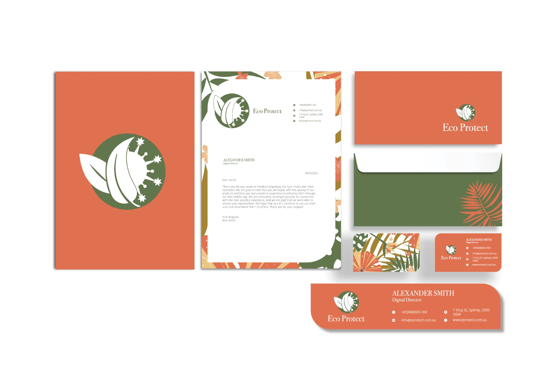
Cat and Bird Studio created the full Eco Protect identity, developing one connected visual system from the logo through to packaging, stationery, digital products and environmental applications.
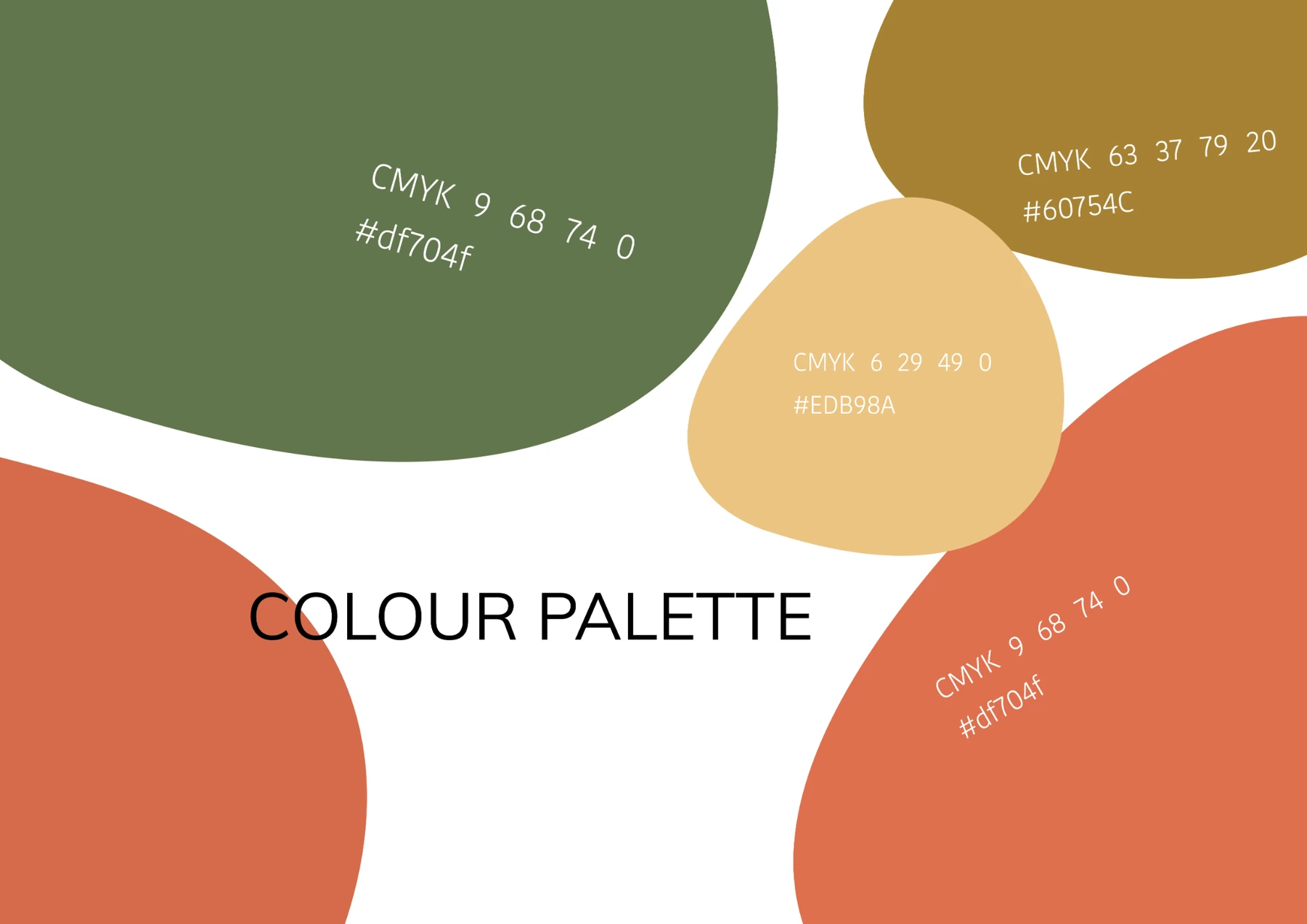
The circular mark combines botanical forms with a protective motif, giving the brand a compact and recognisable symbol. Deep green is balanced with warm terracotta, mustard and sand, creating a bright, contrasting palette that feels natural without becoming muted.
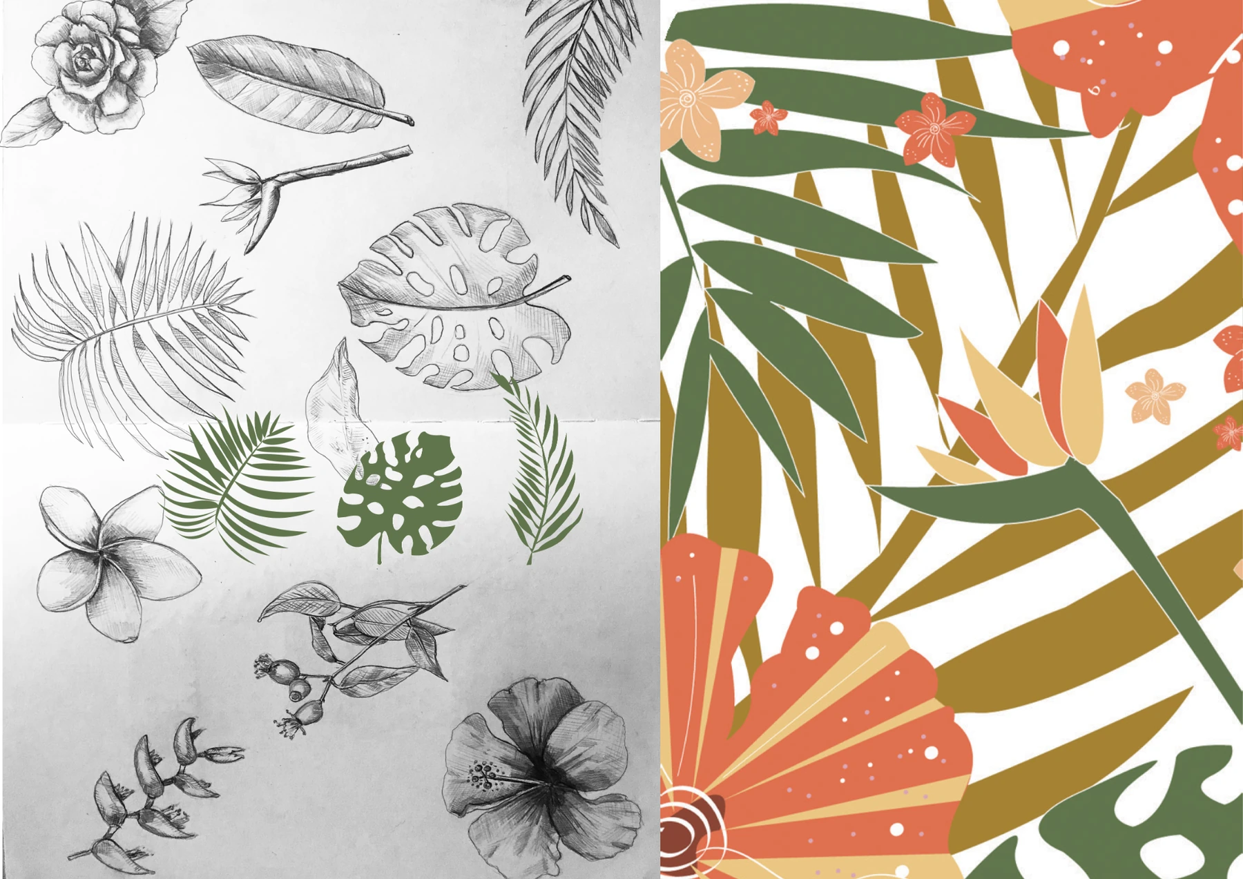
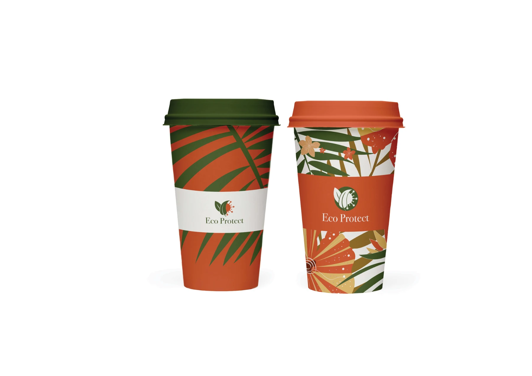
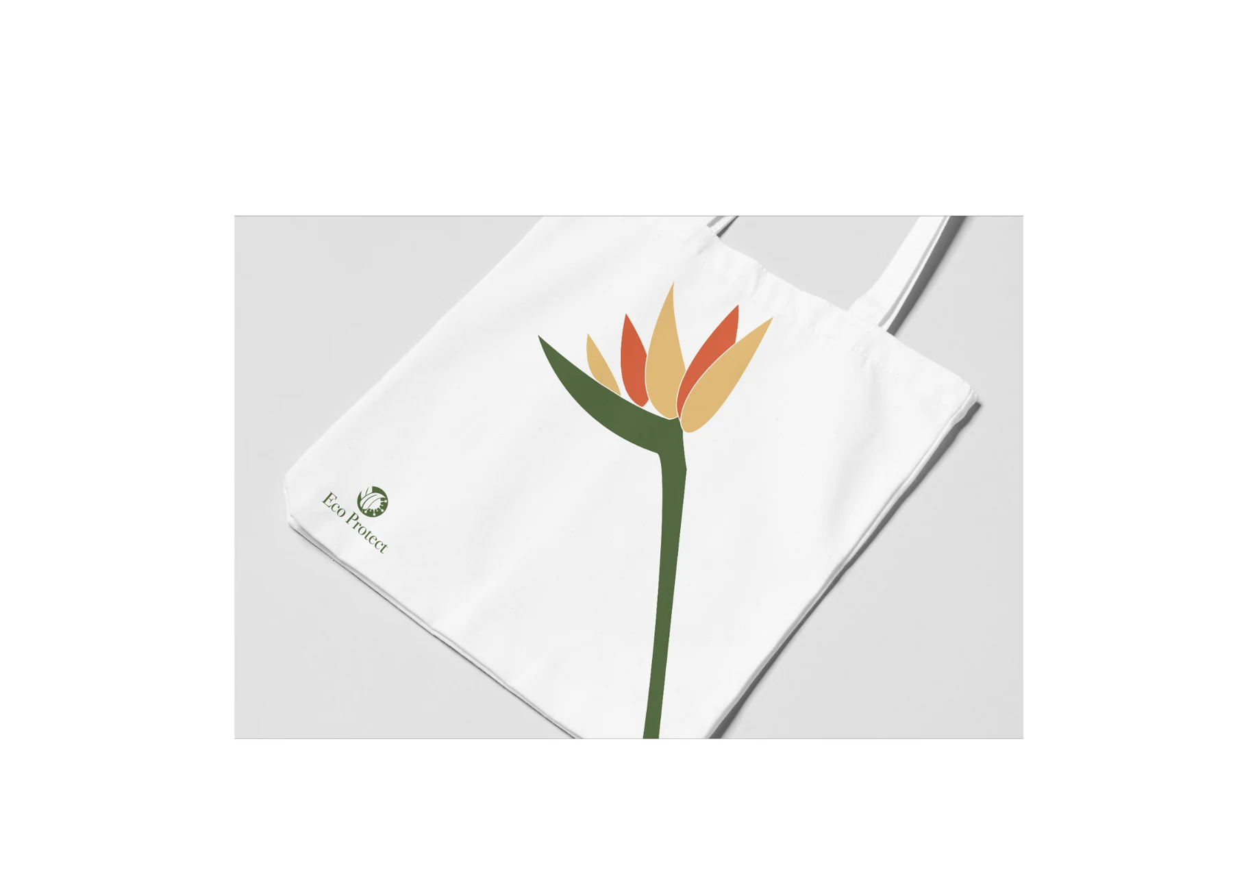
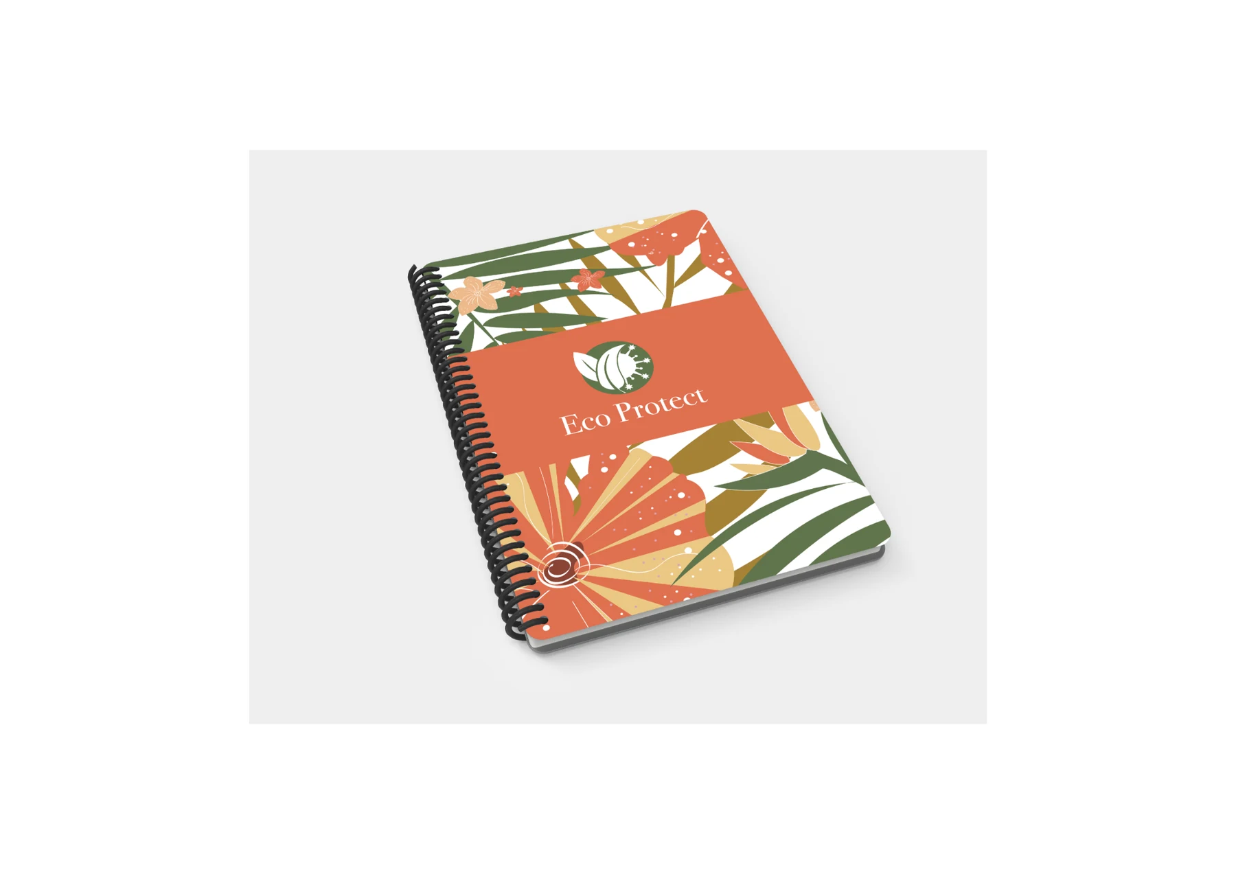
A custom tropical floral pattern became the visual thread across the project. Original hand-drawn plant studies were refined into scalable illustrations and applied to packaging, print, signage, social media, vehicle graphics and merchandise.
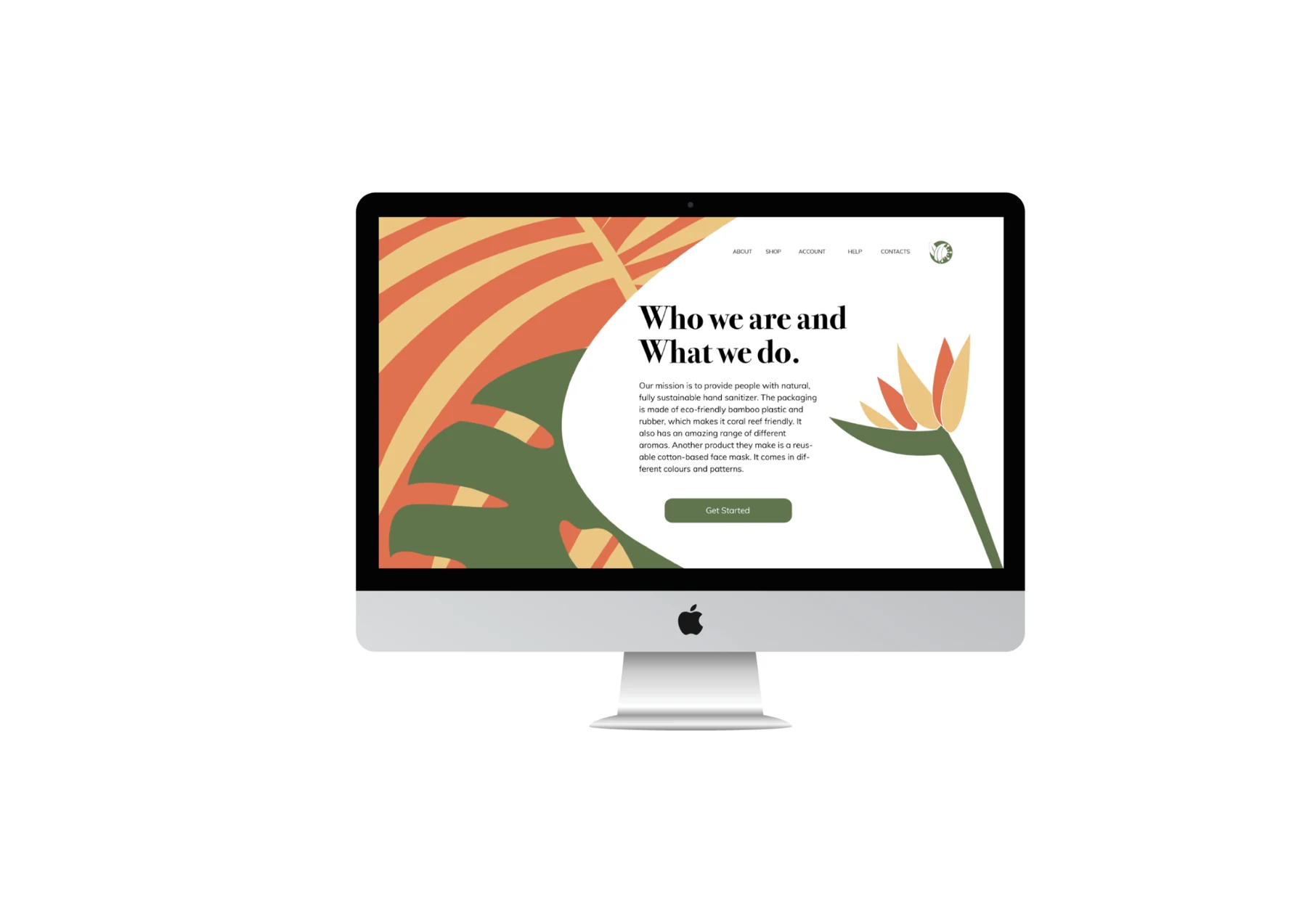
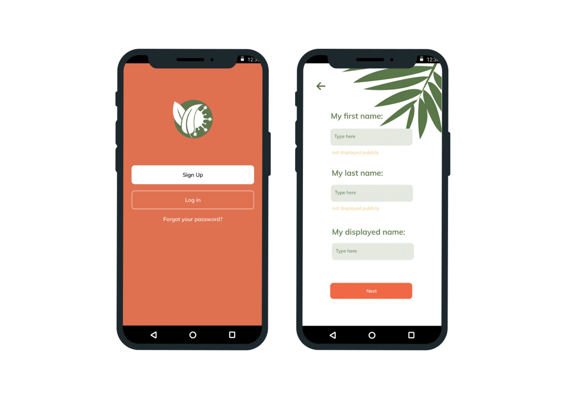
The mobile app and website were designed with generous whitespace, clear form fields and direct actions. Decorative leaves frame the content rather than compete with it, allowing the digital experience to remain simple, useful and unmistakably Eco Protect.
Drawn by hand.
Built to scale.
Botanical sketches formed the basis of a flexible illustration library. Simplified leaf and flower shapes create a bold pattern that can expand across a small product label, a digital screen or a large outdoor application without losing its character.
One identity.
A complete ecosystem.
Brand identity and logo development
Custom botanical illustration and pattern system
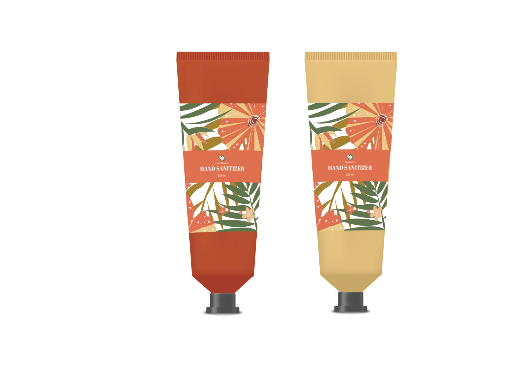
Packaging and product presentation
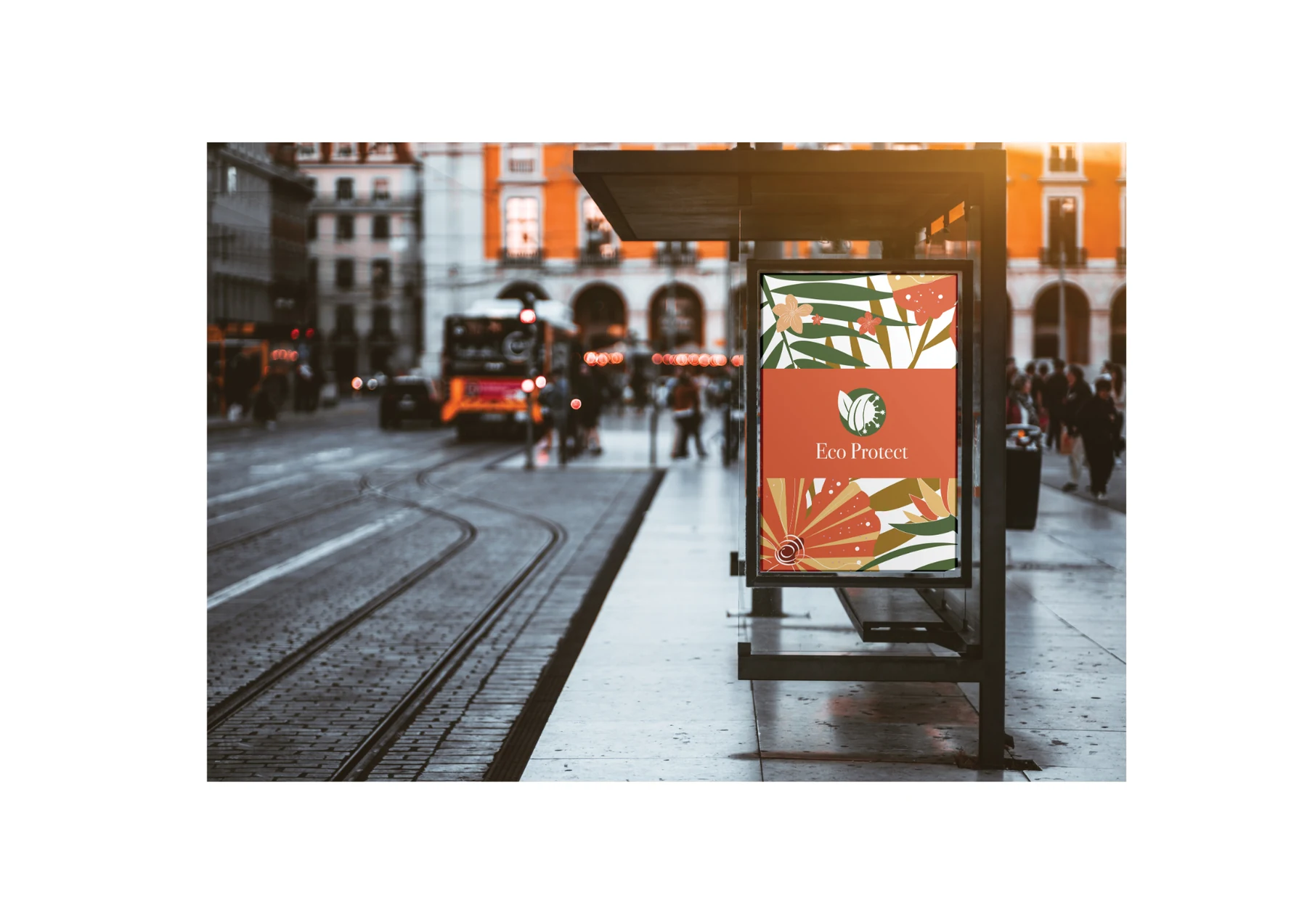
Stationery, print and environmental graphics
Mobile app UX/UI design
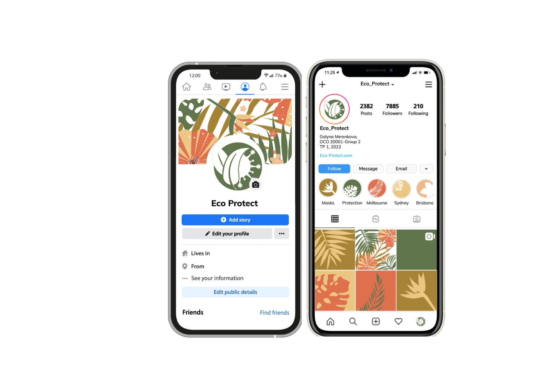
Website and social media design
A flexible identity
made for the real world.
The visual system moves consistently across stationery, packaging, outdoor advertising, branded objects and transport while adapting its scale and density to each format.

Calm to use.
Easy to recognise.
Clear hierarchy, familiar controls and generous spacing keep the digital products accessible. The brand illustrations add warmth at the edges, leaving the main tasks straightforward.
Rules that keep
the expression consistent.
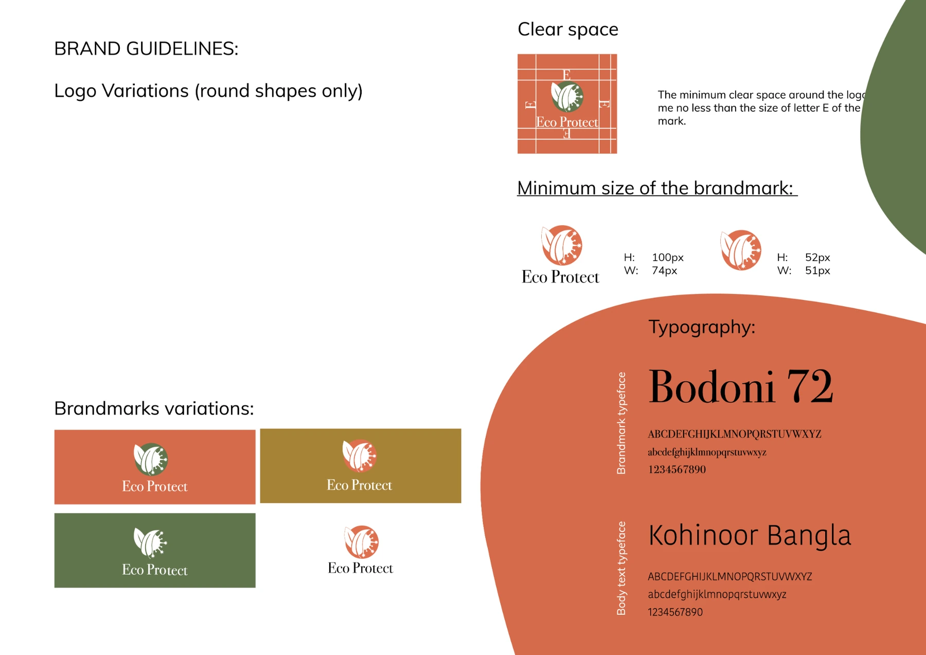
Logo variations, clear-space guidance, typography, colour values and illustration principles make the identity practical to apply across future touchpoints.
A fresh and cohesive identity designed to grow across physical and digital products.
The finished brand is bright, recognisable and flexible. Its distinctive botanical pattern creates immediate visual impact, while the clear underlying system keeps every application—from packaging and stationery to app screens and signage—connected and easy to identify.
Back to our work