
ClientDoctor App
ScopeBrand identity & website design
IndustryApp and software development
ApproachCreated from scratch
A vibrant digital identity designed to feel like a product.
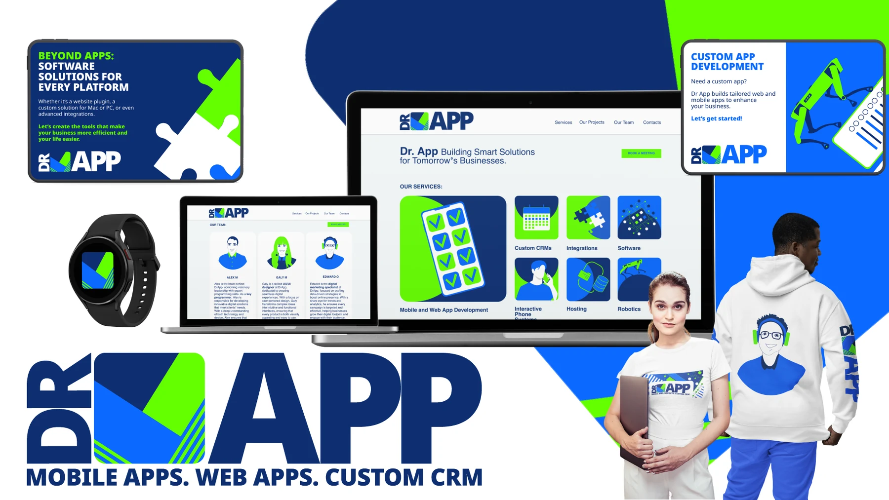
Cat and Bird Studio created the brand identity and website for Doctor App, a mobile and web app development company.
Starting from a blank page, we developed a contemporary visual system that communicates technical capability with energy, clarity and approachability. The logo centres on an app-style square icon with an integrated tick, representing completed tasks, reliable delivery and smart solutions that work.
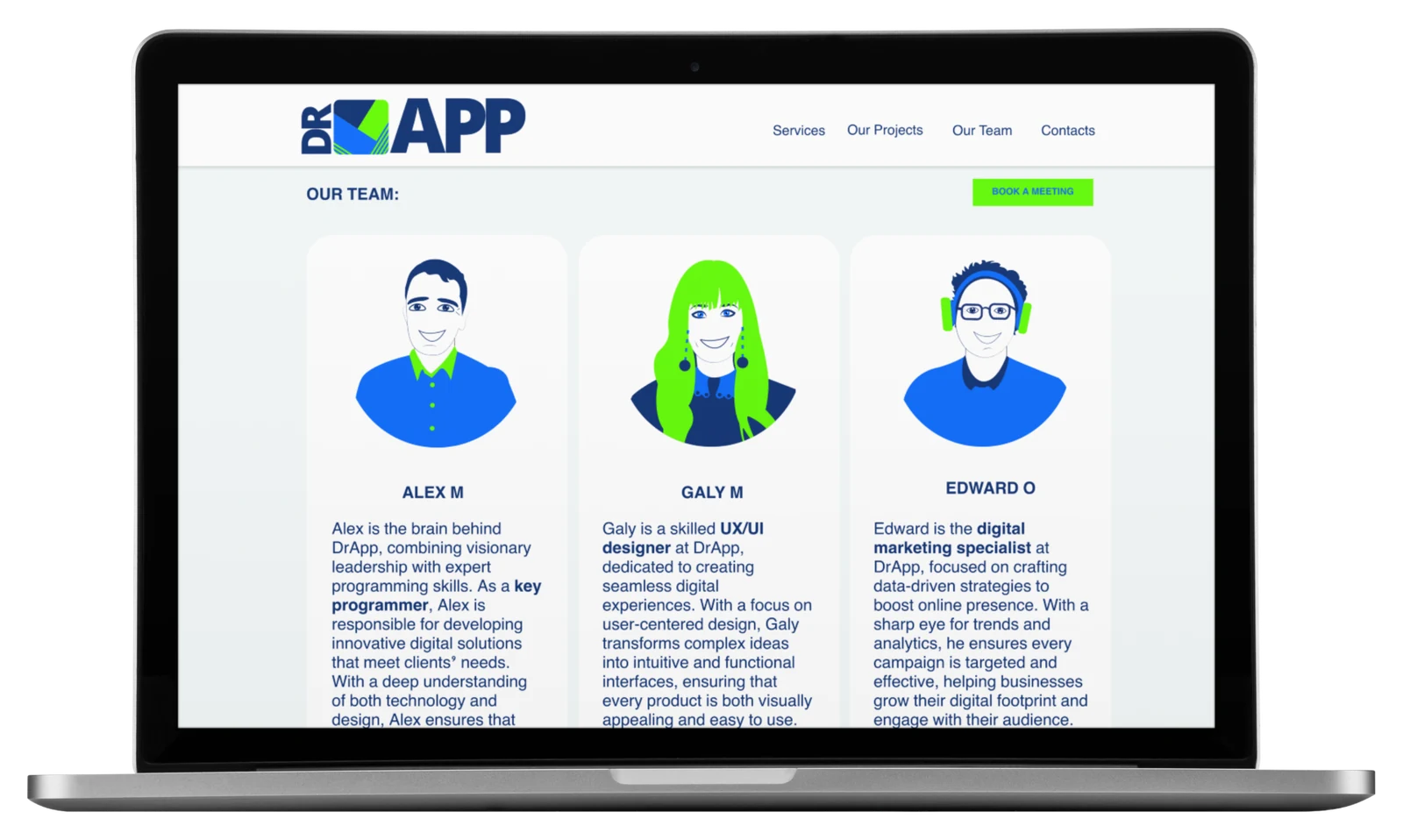
Electric blue, deep navy and vivid green give the identity strong technology associations and high contrast across digital screens, print, social media and merchandise. Custom service icons and illustrated team portraits add personality while keeping the system cohesive.
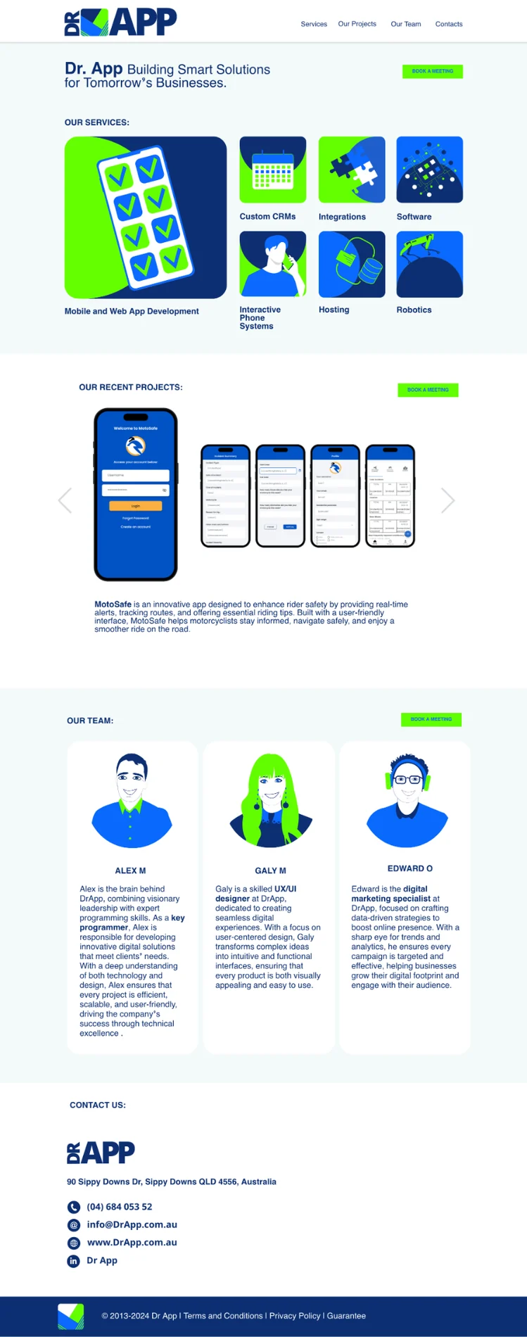
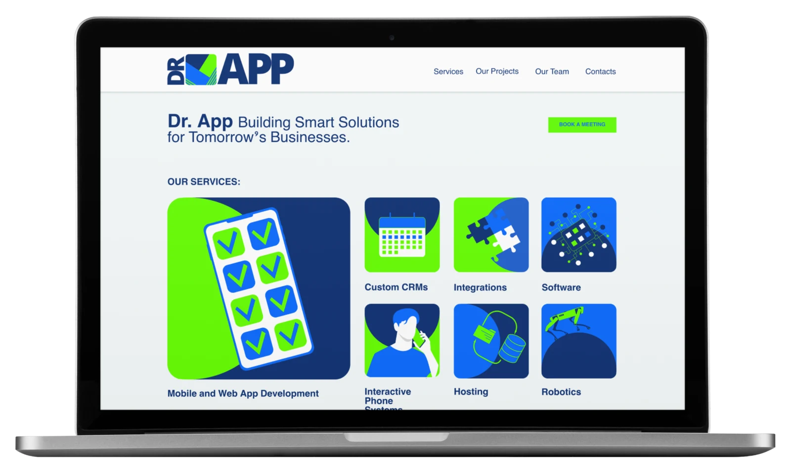
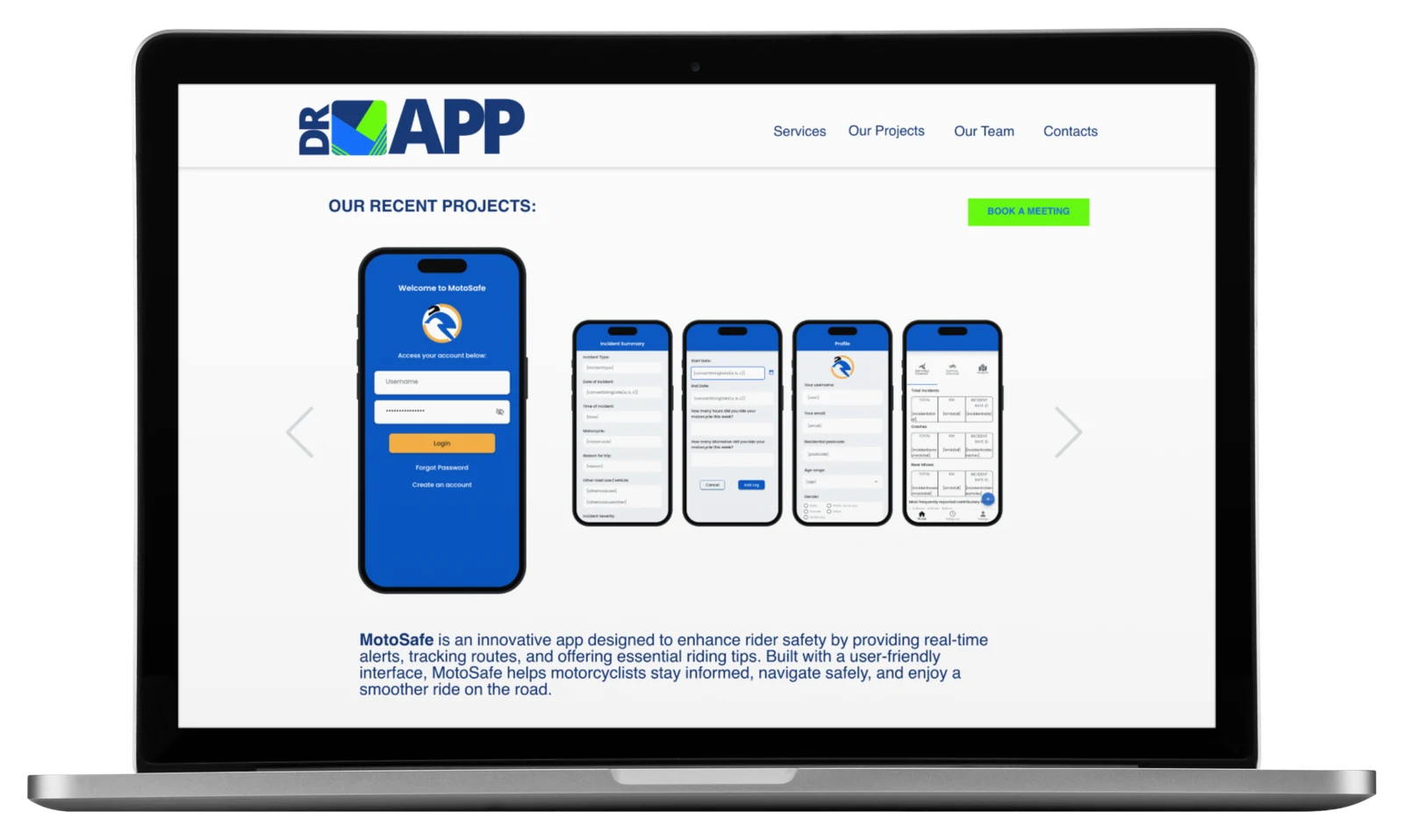
The website was designed around familiar app behaviour. Large modular service tiles, concise labels and a short top-level navigation make projects, team information and contact pathways easy to reach. The result is a clean interface that helps visitors understand Doctor App’s services and move through the site without friction.
An app icon with
a built-in promise.
The compact square mark references a mobile app tile, while the integrated tick communicates confidence, completion and practical outcomes. The bright palette keeps the identity energetic and unmistakably digital.
One bold system.
Every touchpoint.
Brand identity and logo design
Website UX/UI design and navigation
Custom service icons and team illustrations
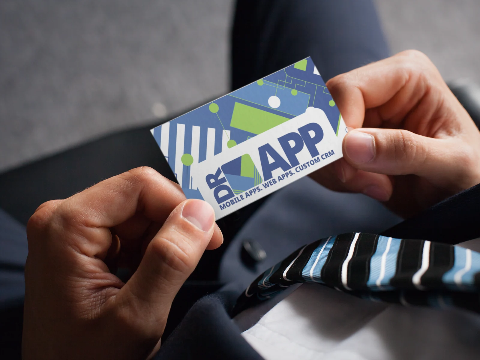
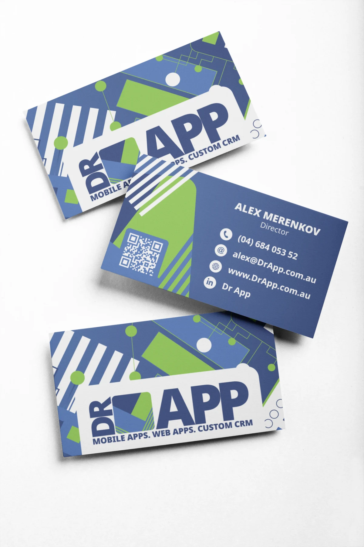
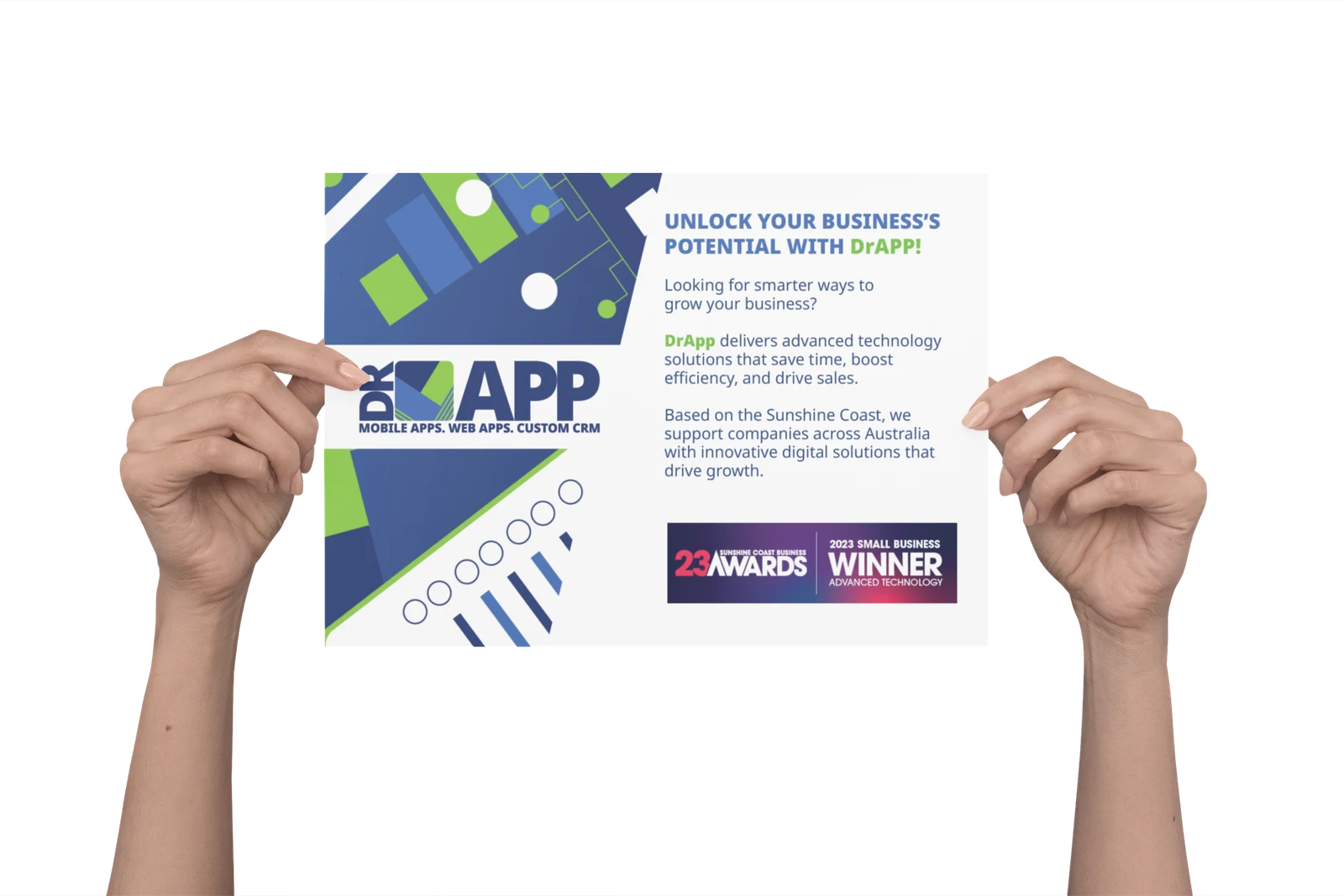
Business cards and printed collateral
Social media content system
Branded merchandise and campaign assets
Navigation that feels
familiar at first tap.
Services are organised as clear app-like modules, supported by direct navigation to projects, the team and contact information. Strong hierarchy and generous spacing keep the technical content easy to scan.
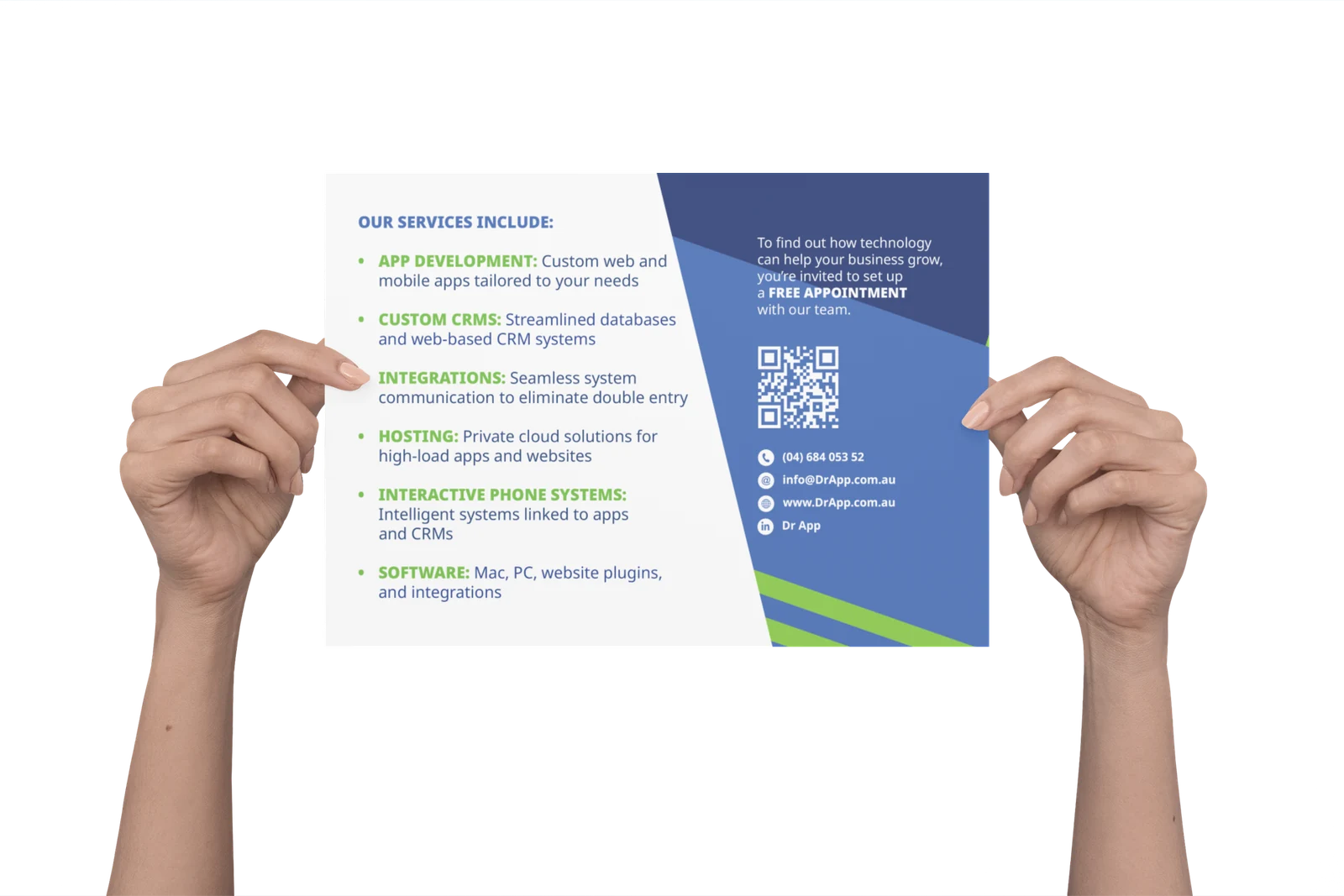
Consistent from
screen to print.
The visual language extends through business cards, promotional flyers and campaign materials without losing the clarity of the core identity.
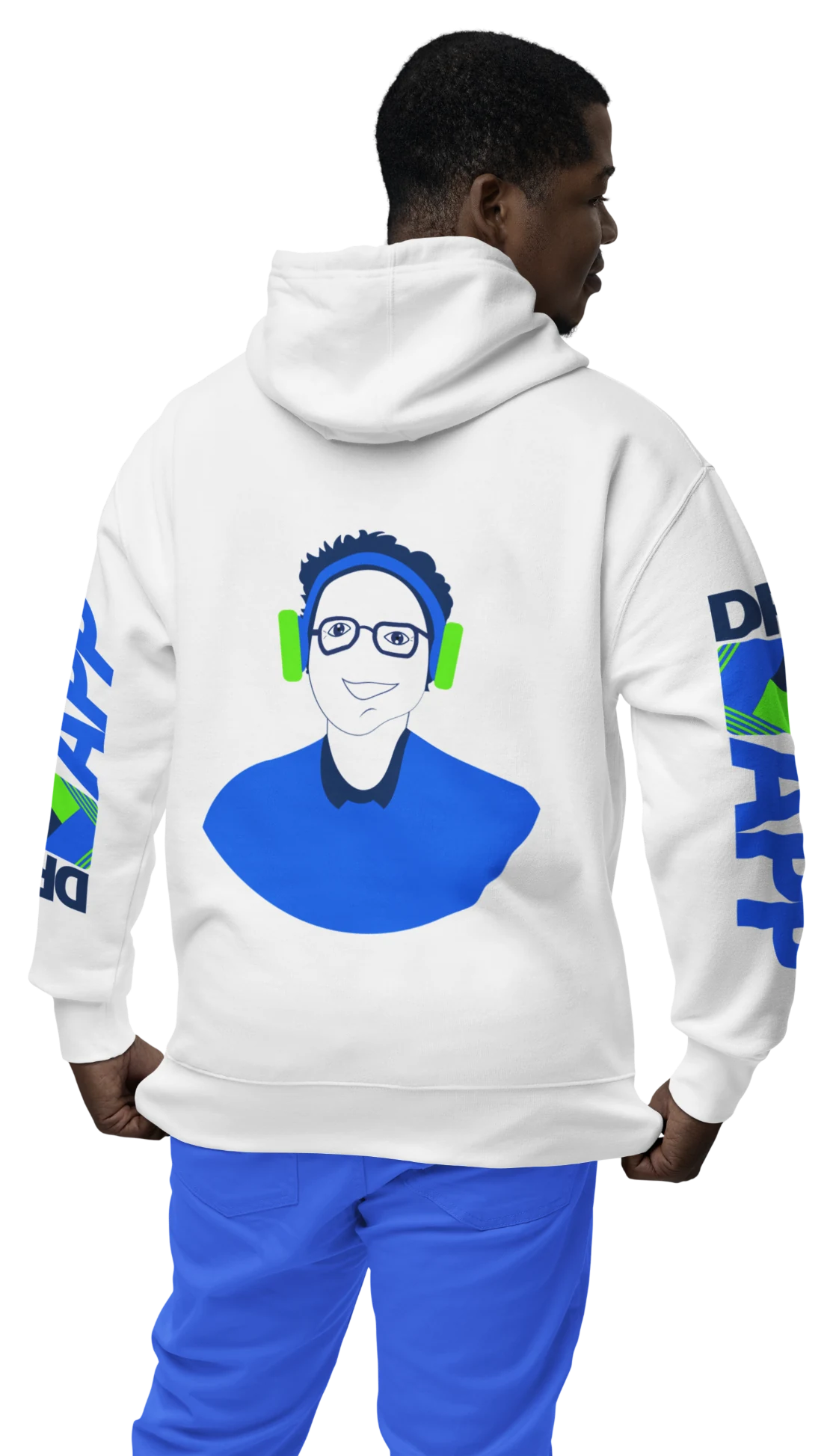
A brand built
to travel.
The strong colour system and illustration style remain recognisable across apparel and promotional applications.

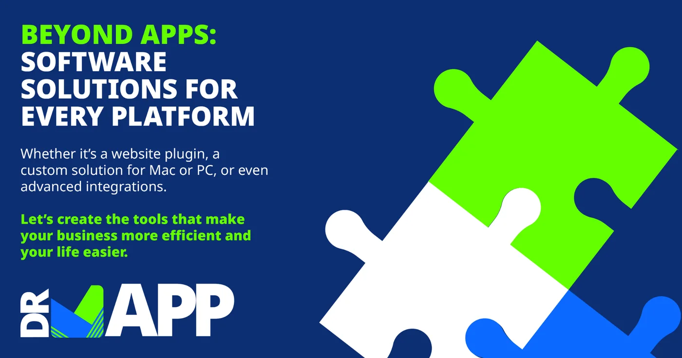
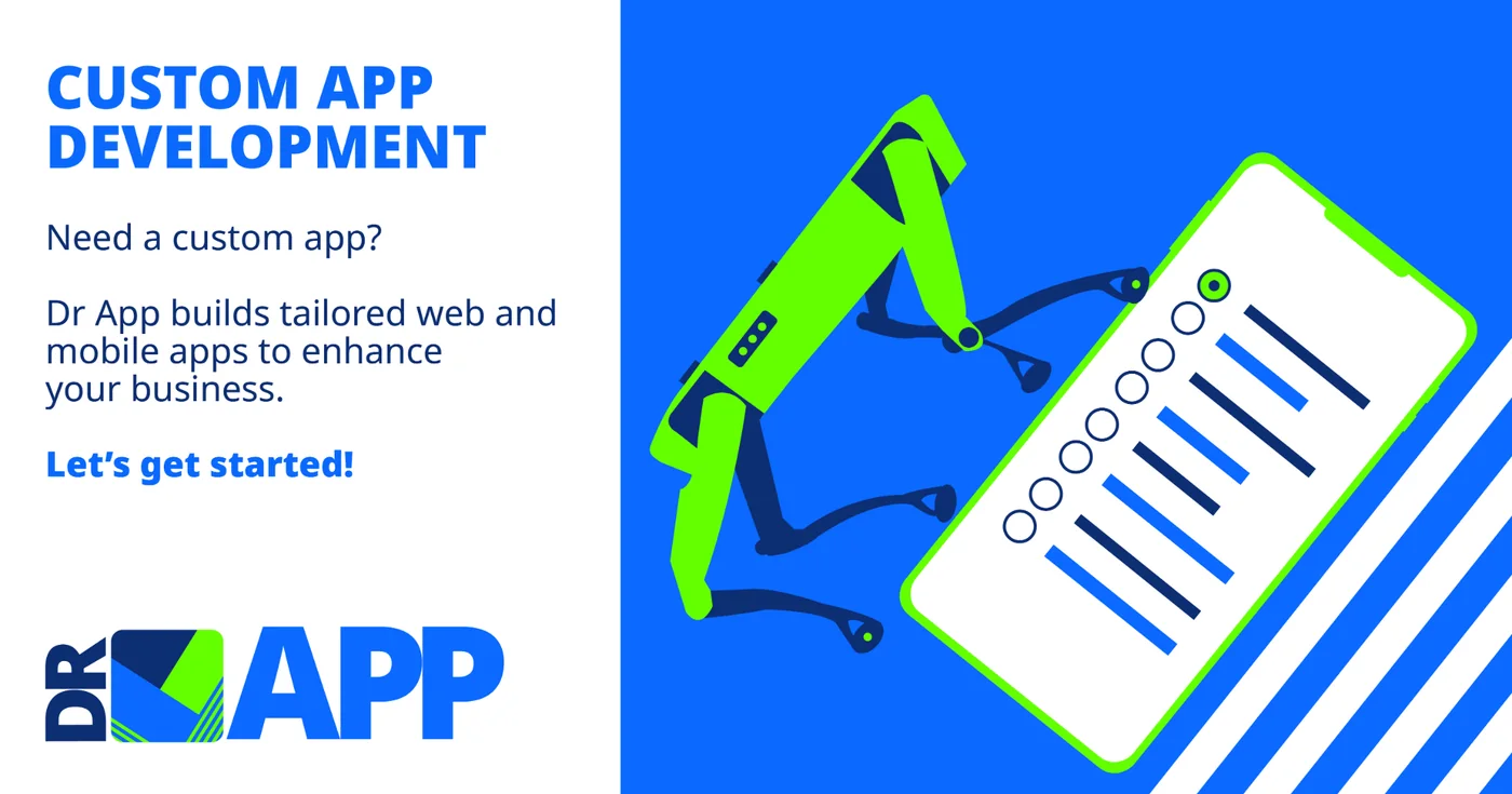
Complex services.
Clear visual stories.
A flexible campaign system translates technical services into bold, approachable graphics that are easy to recognise and understand in a busy feed.

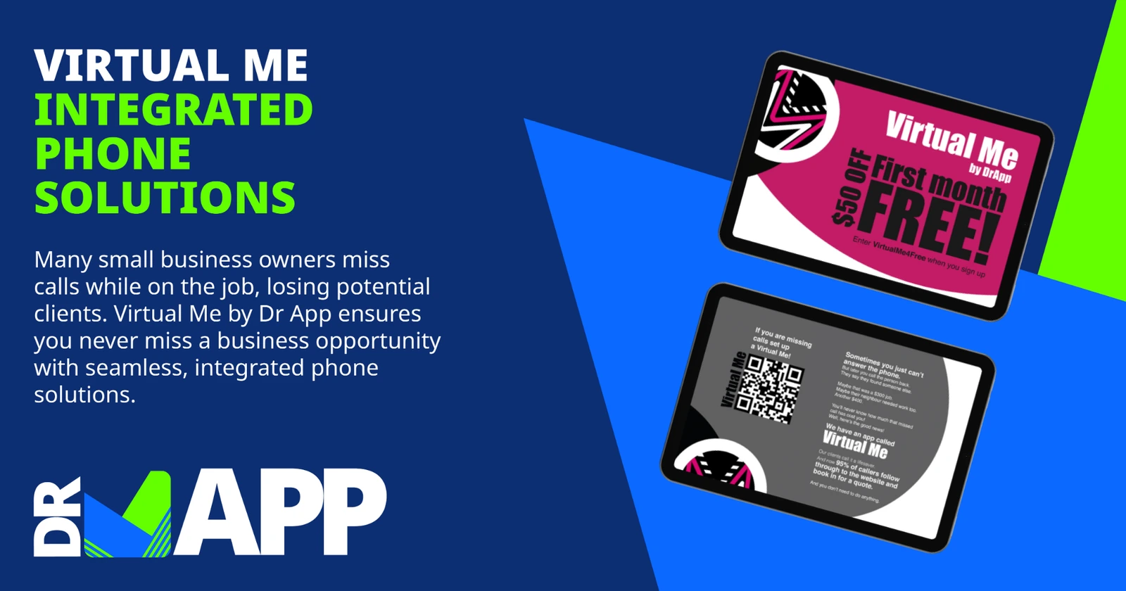



A distinctive technology brand with a clear, product-led digital experience.
The result is a vibrant and contemporary identity that gives Doctor App a confident presence across web, print, social media and merchandise. The clean website structure makes a broad technical offer easier to understand, while the app-inspired navigation and custom illustrations give the company a recognisable personality.
Back to our work