
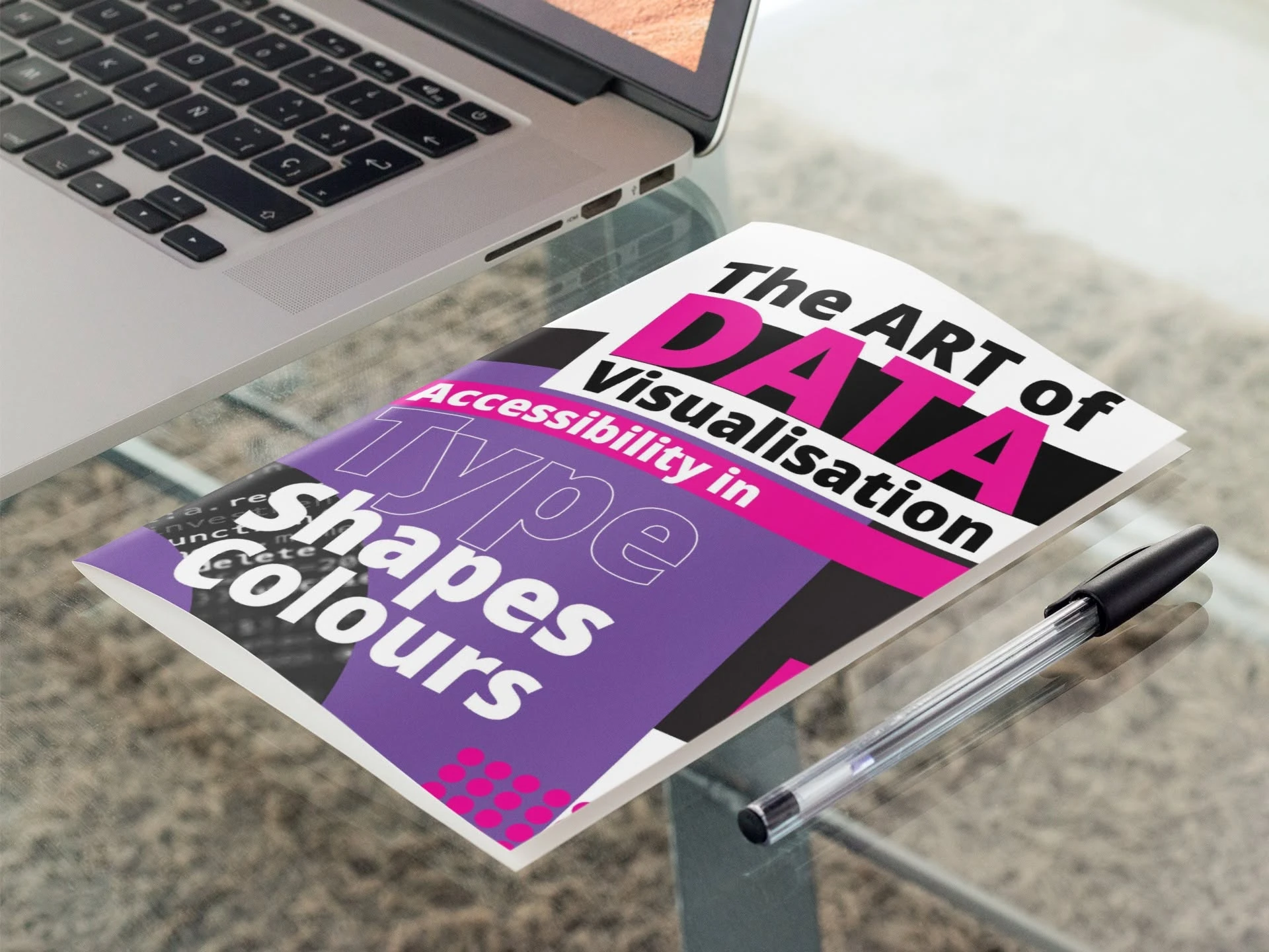
FormatEditorial magazine
SubjectData visualisation and accessibility
ScopeArt direction, layout and image treatment
ApproachBold, high-contrast and structured
A magazine that demonstrates the principles it explains.
The publication explores how typography, colour, shape and accessibility influence the way data is understood. The design therefore needed to do more than present written content - it had to model clear visual communication throughout every spread.
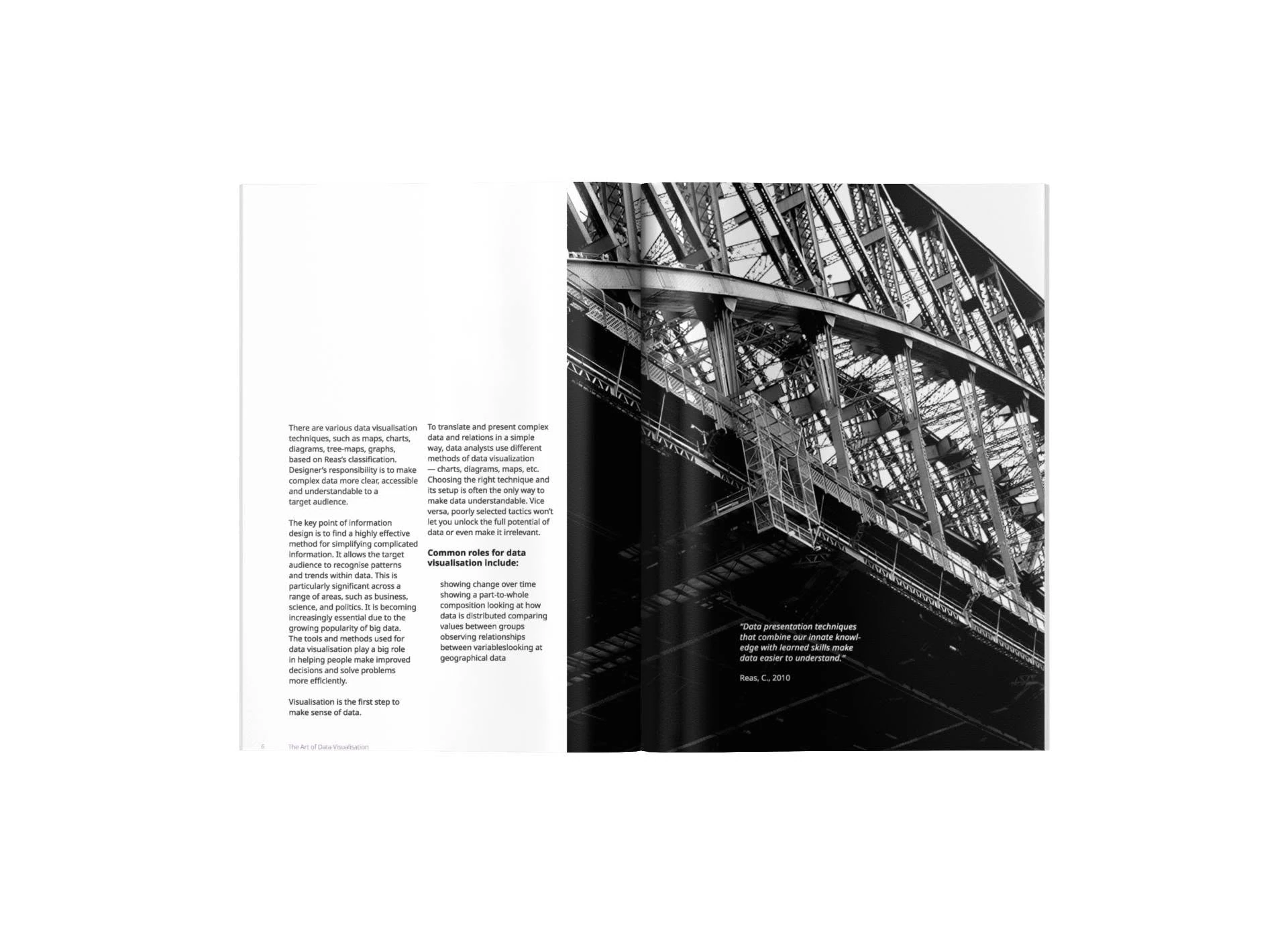
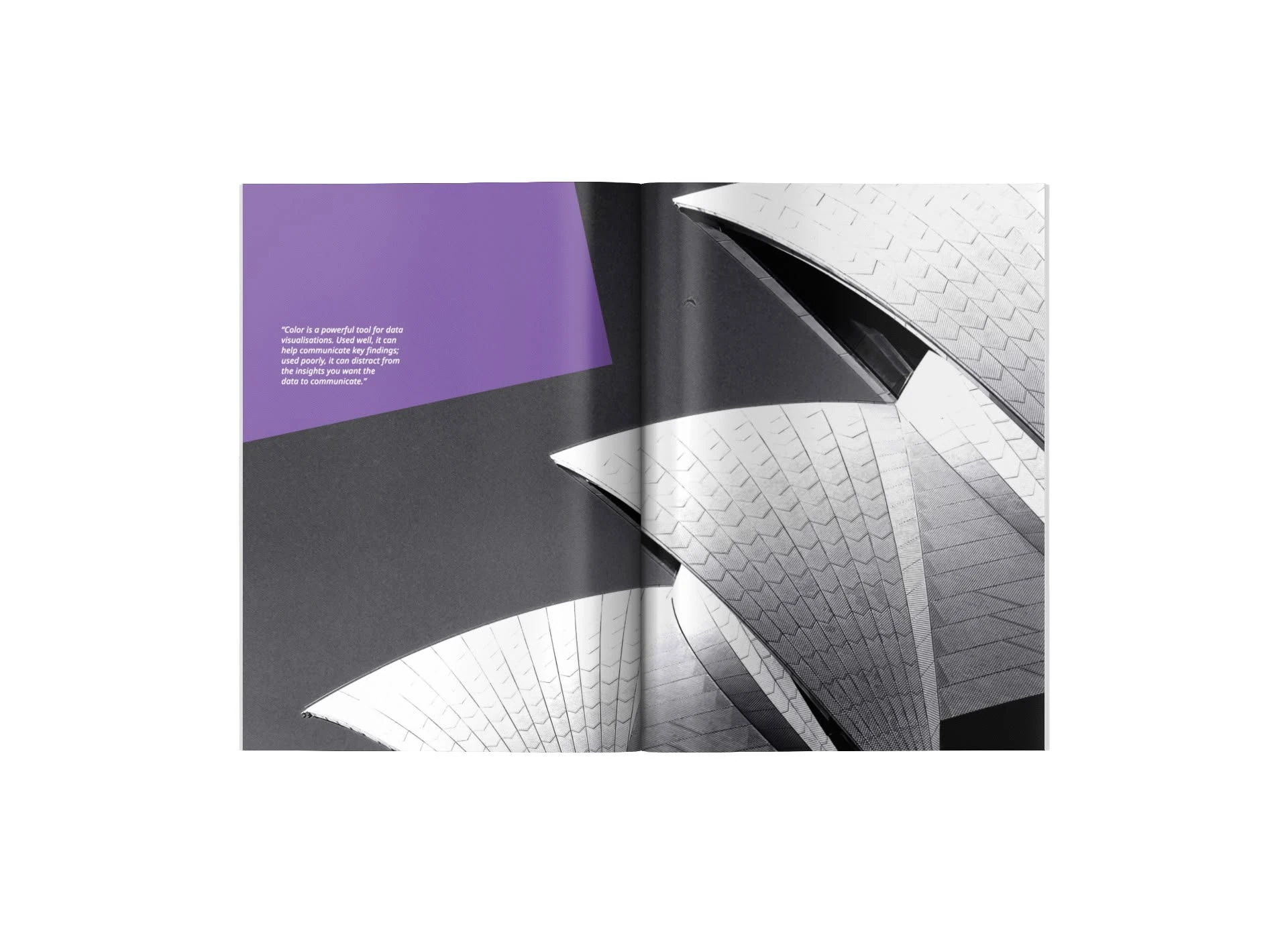
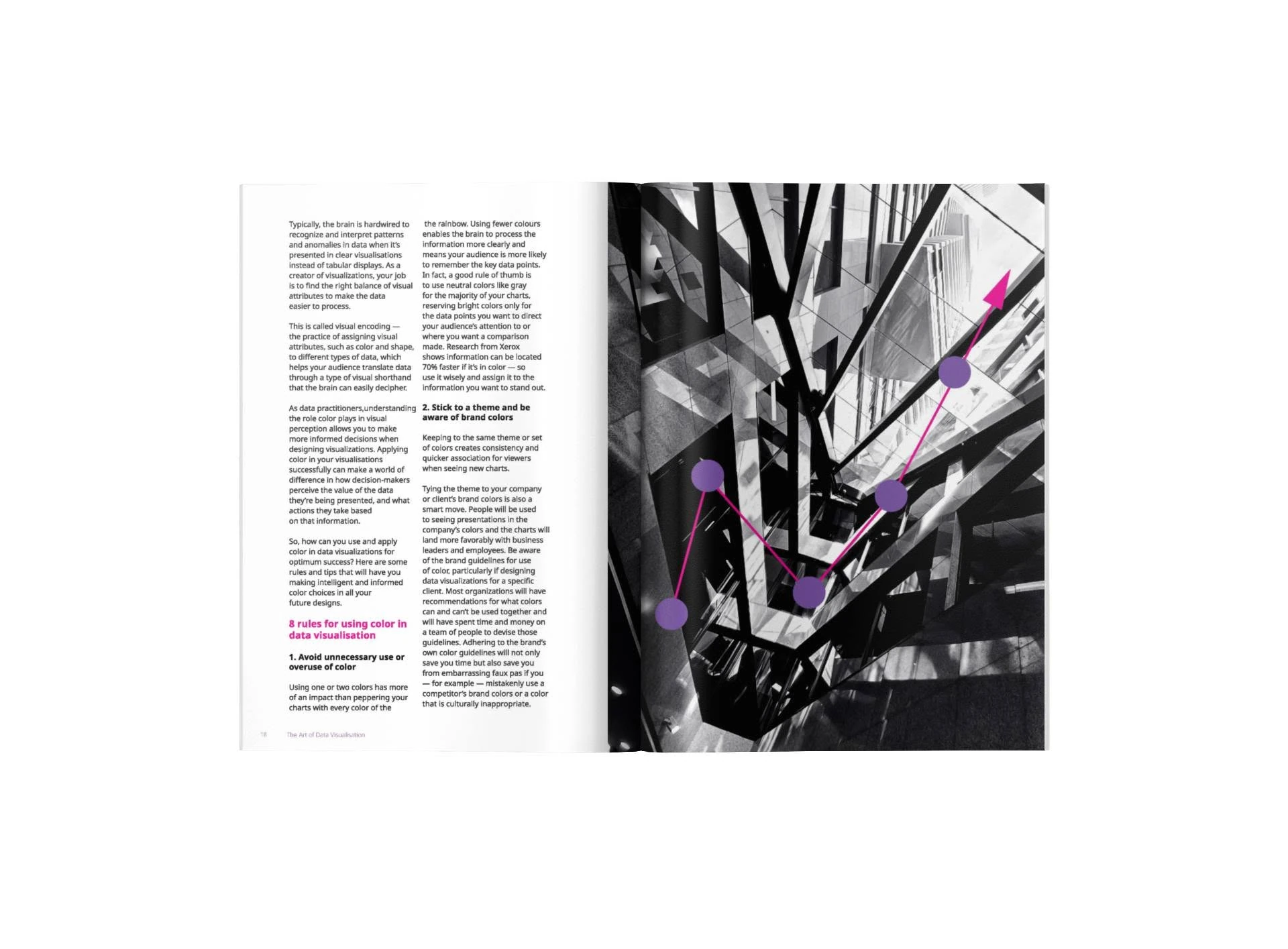
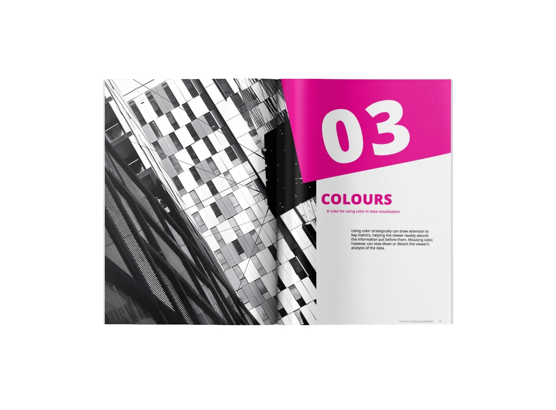
Black-and-white architectural photography creates a strong, analytical foundation. Magenta and purple accents are used selectively to direct attention, identify sections and demonstrate how limited colour can clarify information without overwhelming the reader.
A modular editorial grid supports dense copy, pull quotes, diagrams and visual examples. Large section numbers and concise headings make the structure easy to scan, while generous white space keeps the reading experience calm and contemporary.
High contrast.
Purposeful colour.
Architectural forms echo charts, networks and systems. Circular dots, lines and directional graphics are placed over photography to connect abstract information-design principles with a strong editorial image language.
The result is visually expressive without sacrificing legibility - an important consideration for a publication discussing accessible data communication.
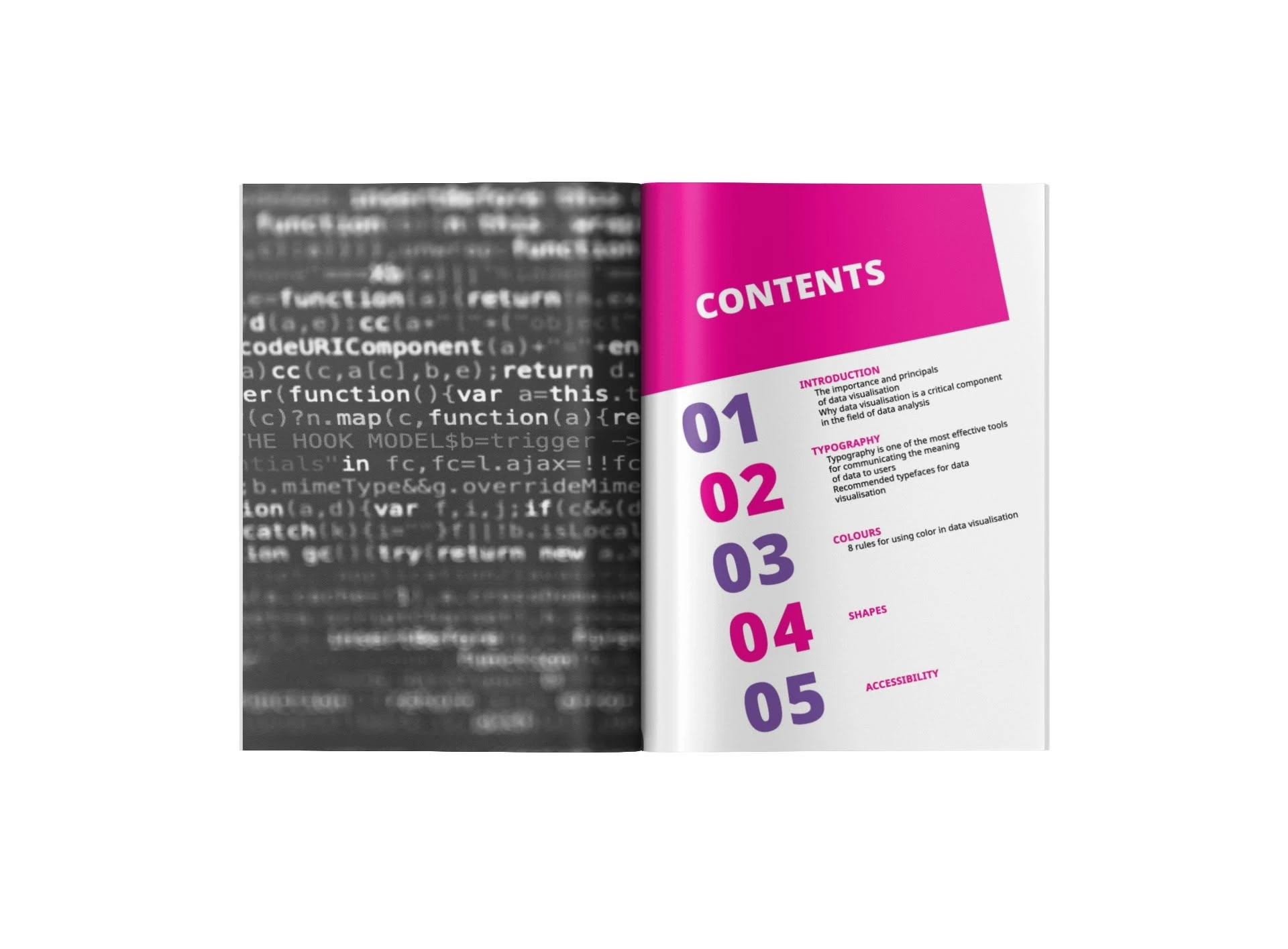
Complex ideas.
Simple navigation.
Magazine concept and editorial art direction
Modular grid for long-form and visual content
High-contrast typography and section hierarchy
Colour strategy for emphasis and wayfinding
Charts and graphics integrated with photography
Accessibility-led information presentation
Editorial rhythm
with visual precision.
Large image moments alternate with focused text pages, helping the publication move between explanation, example and reflection without losing a consistent visual identity.
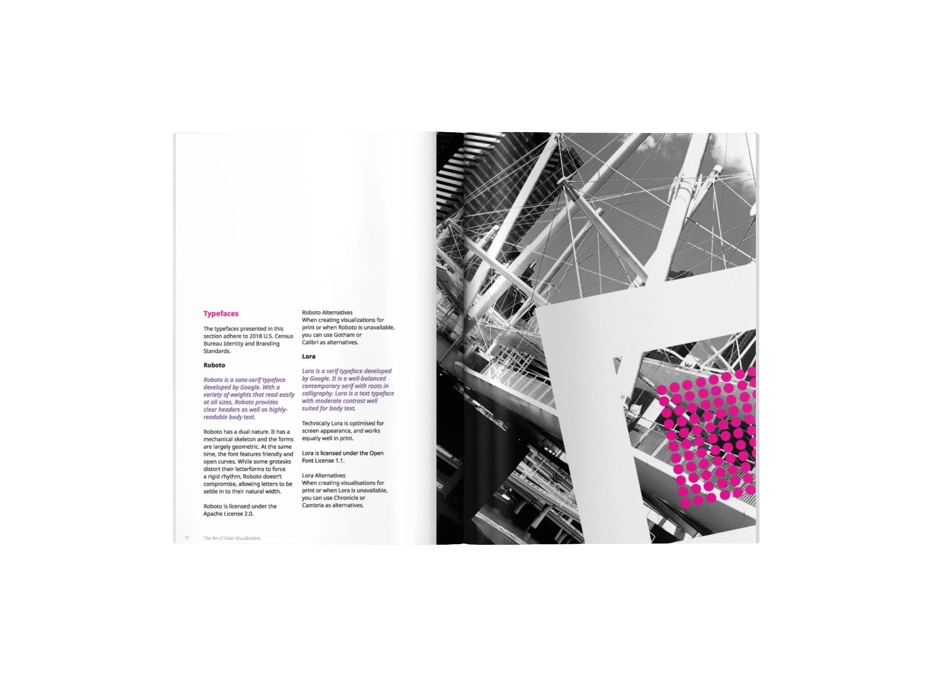
A bold publication that makes information design feel tangible.
The completed magazine turns a technical subject into a clear visual experience. It balances research, editorial storytelling and graphic demonstration, using a focused palette and disciplined grid to show how good design can make complex information easier to understand.
Back to our work