
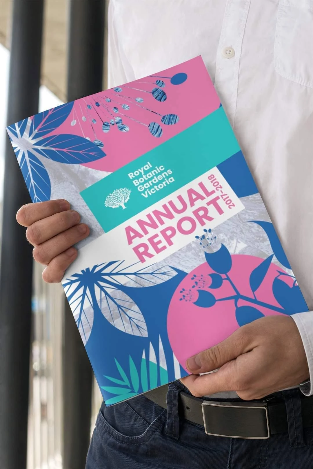
OrganisationRoyal Botanic Gardens Victoria
ContextSwinburne University of Technology student project
ScopeAnnual report and information design
ApproachClear, contemporary and botanical
Dense information, organised into a clear editorial journey.
This university project explored how a large annual report could communicate complex organisational, scientific and financial information without feeling heavy. The design uses a disciplined grid, generous white space and strong chapter openers to create an easy reading rhythm from overview through to detailed reporting.
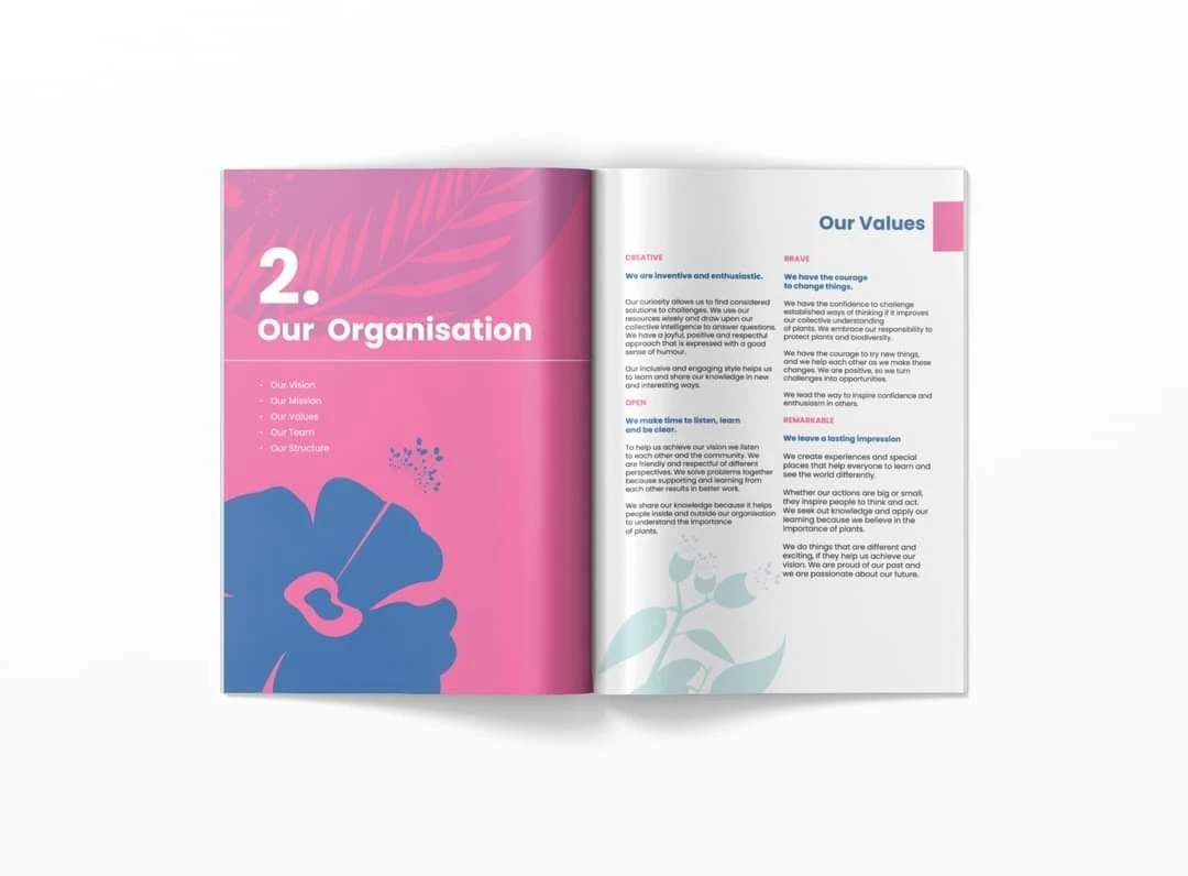
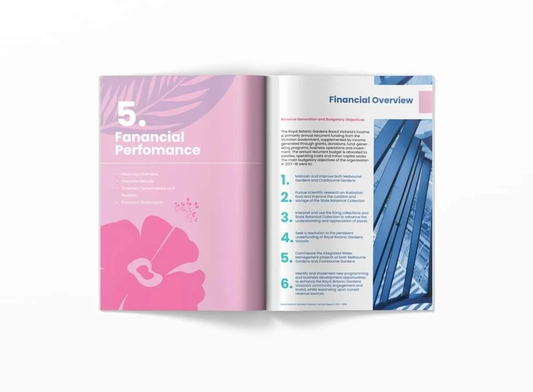
A colour-coded section system helps readers recognise where they are in the document. Pink, teal and deep blue distinguish major themes, while botanical silhouettes connect the report to the living collections and research work of the gardens.
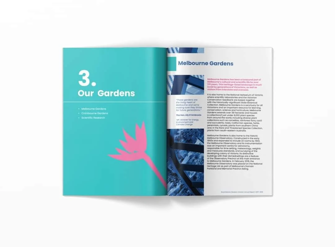
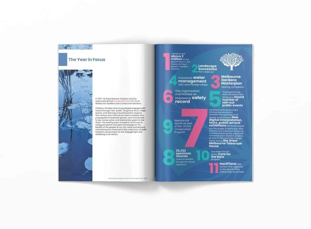
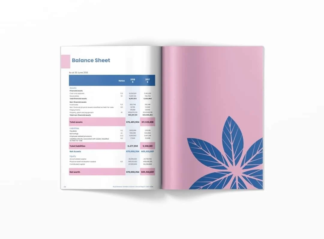
Infographics, large numerical callouts and carefully structured tables turn data into approachable visual information. Photography is treated as an editorial element rather than decoration, supporting both the institutional tone and the human story behind the organisation.
Modern structure.
Botanical character.
Consistent typography and modular page templates make the publication feel cohesive, while oversized chapter numbers, plant forms and changing colour fields give each section its own identity.
The visual system was designed to work equally well for narrative content, research summaries, achievements, financial statements and information-rich infographics.
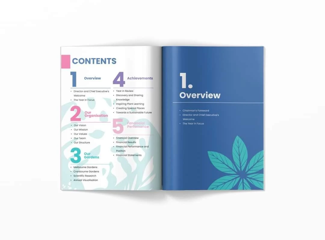
Information with
a clear hierarchy.
Annual report art direction and page architecture
Colour-coded chapter and navigation system
Typography and long-form reading hierarchy
Infographics, statistics and key-number callouts
Financial table and balance-sheet presentation
Botanical image treatment and section illustration
A report designed
to be read.
Each spread balances visual interest with practical reading needs, allowing short summaries, long-form copy, data and financial detail to sit within one coherent system.
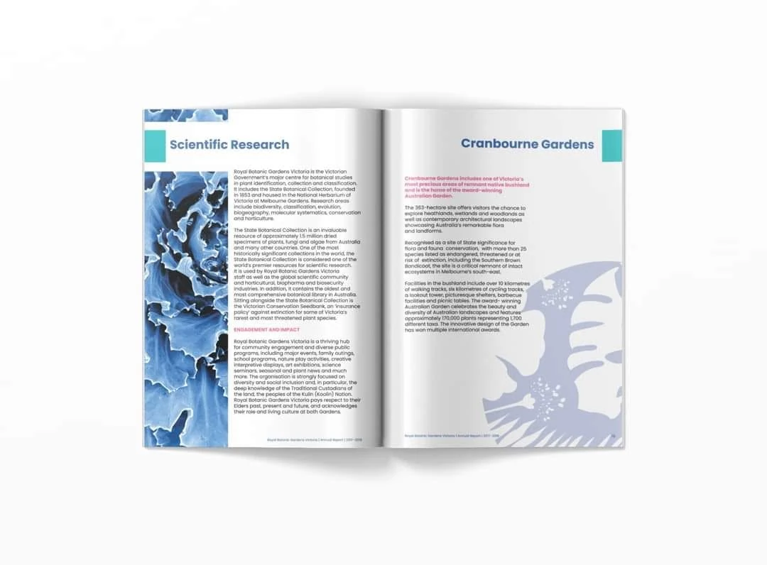
An annual report that feels organised, contemporary and engaging.
The final concept shows how a public-facing report can preserve accuracy and institutional credibility while remaining approachable. Strong hierarchy, colour, infographics and botanical details help readers navigate a large volume of information with confidence.
Back to our work